DAMOCLÈS
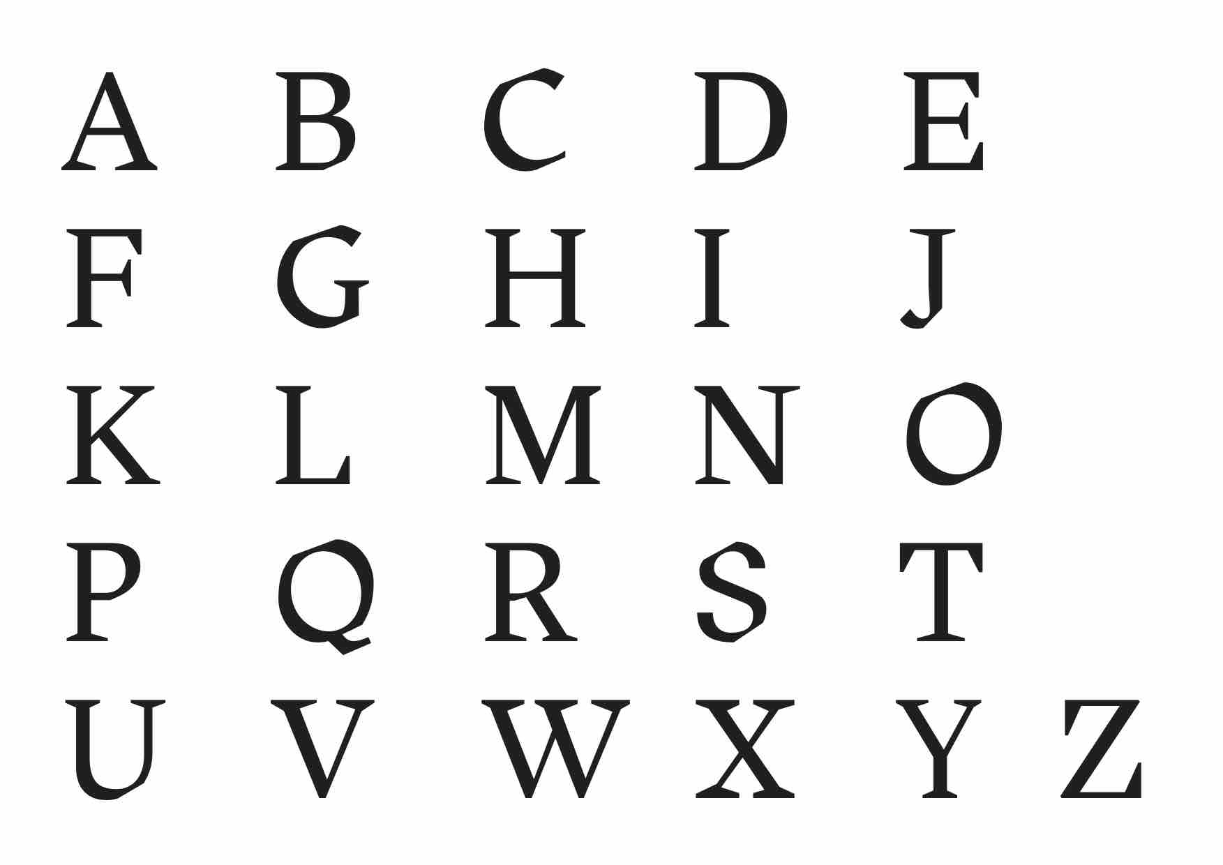
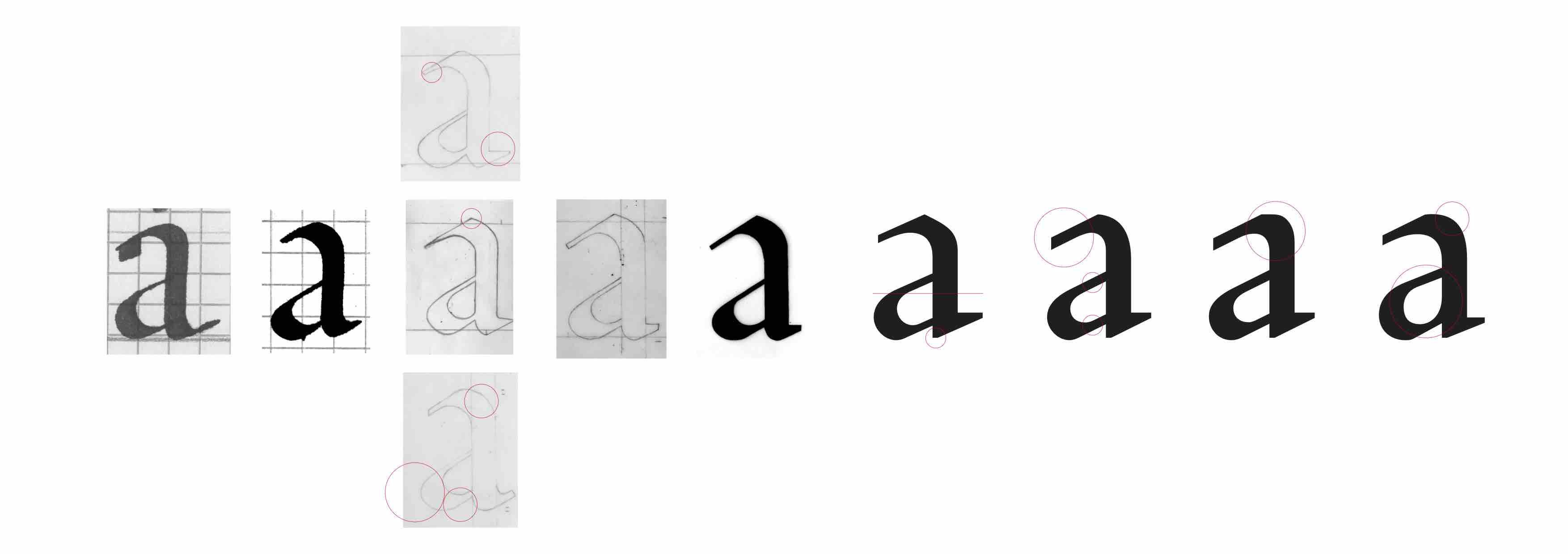
This is the first typography I have ever designed. After drawing letters with a calligraphy ink pen with a blunt edge I combined my alphabet with two other alphabets that my classmates drew. This combination created new styles and
I accentuated the letters’ characteristics when
I drew them a second time by hand.
The sharp edges of the letters is the main particularity of this typography.
The antique character which is distinctive to the Garaldes and reminded me of the Greek myths. More precisely, to the sword of Damocles which is a reference of the letters’ sharpness.
The dramatic effect of this typography is accentuated with the specimen. It combines a range of the colours black, white and red and images related to the Greek mythology and references to sharp/cutting objects.
Typography
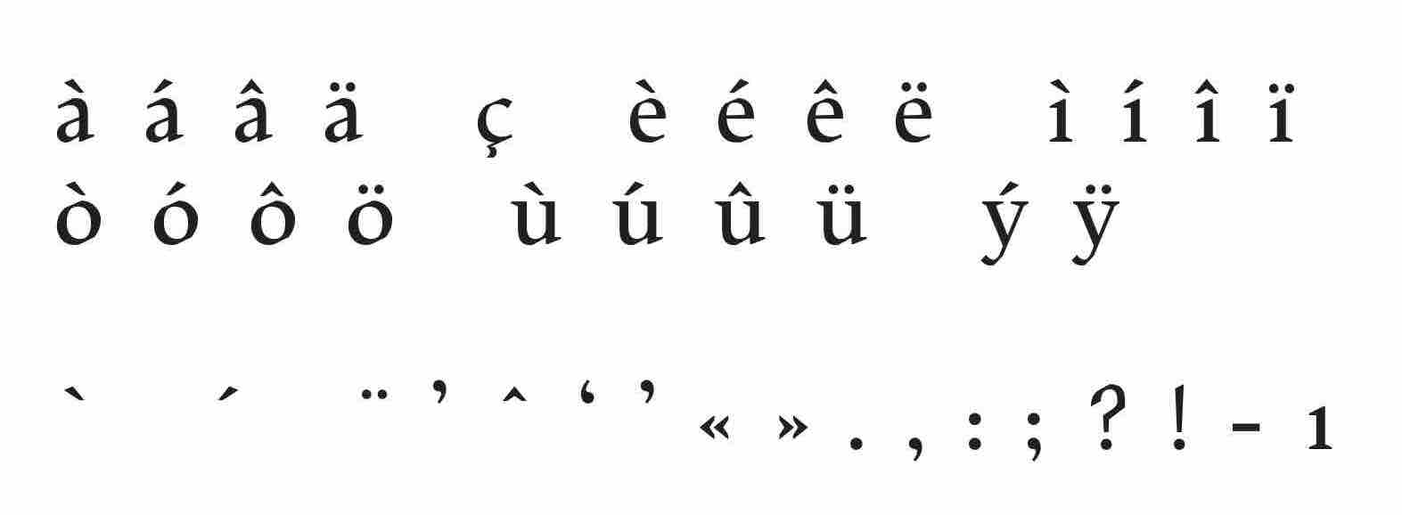
Uppercase letters, lowercase letters, accents, glyphs
May 2019


