DONKERE KAMER
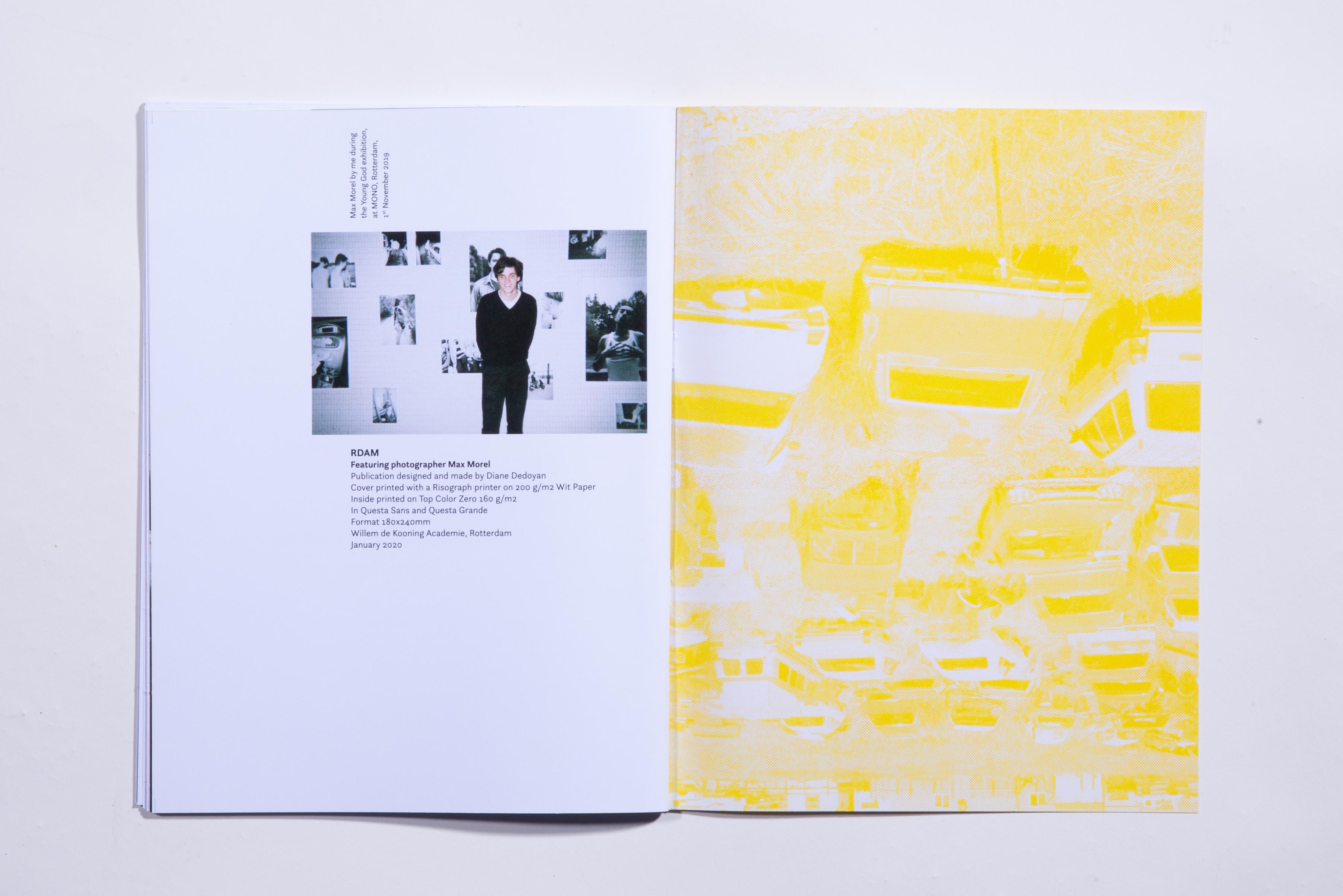
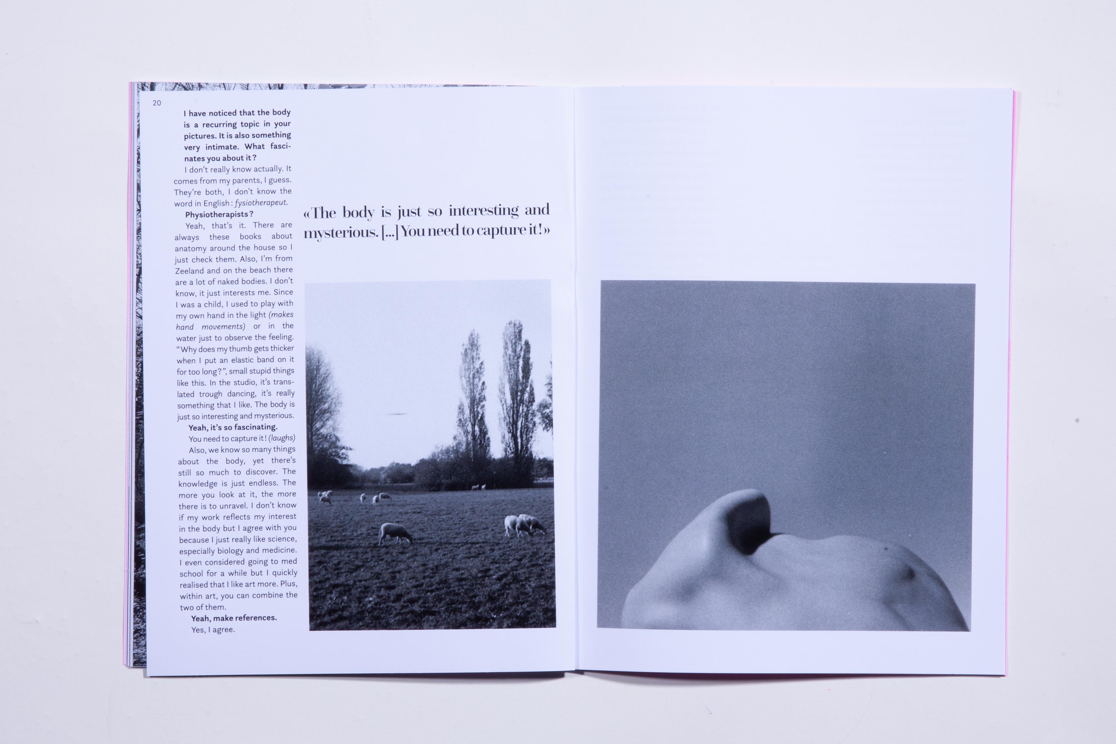
In the end of my exchange semester at the Willem de Kooning Academie in Rotterdam,we had one month to make a free project.
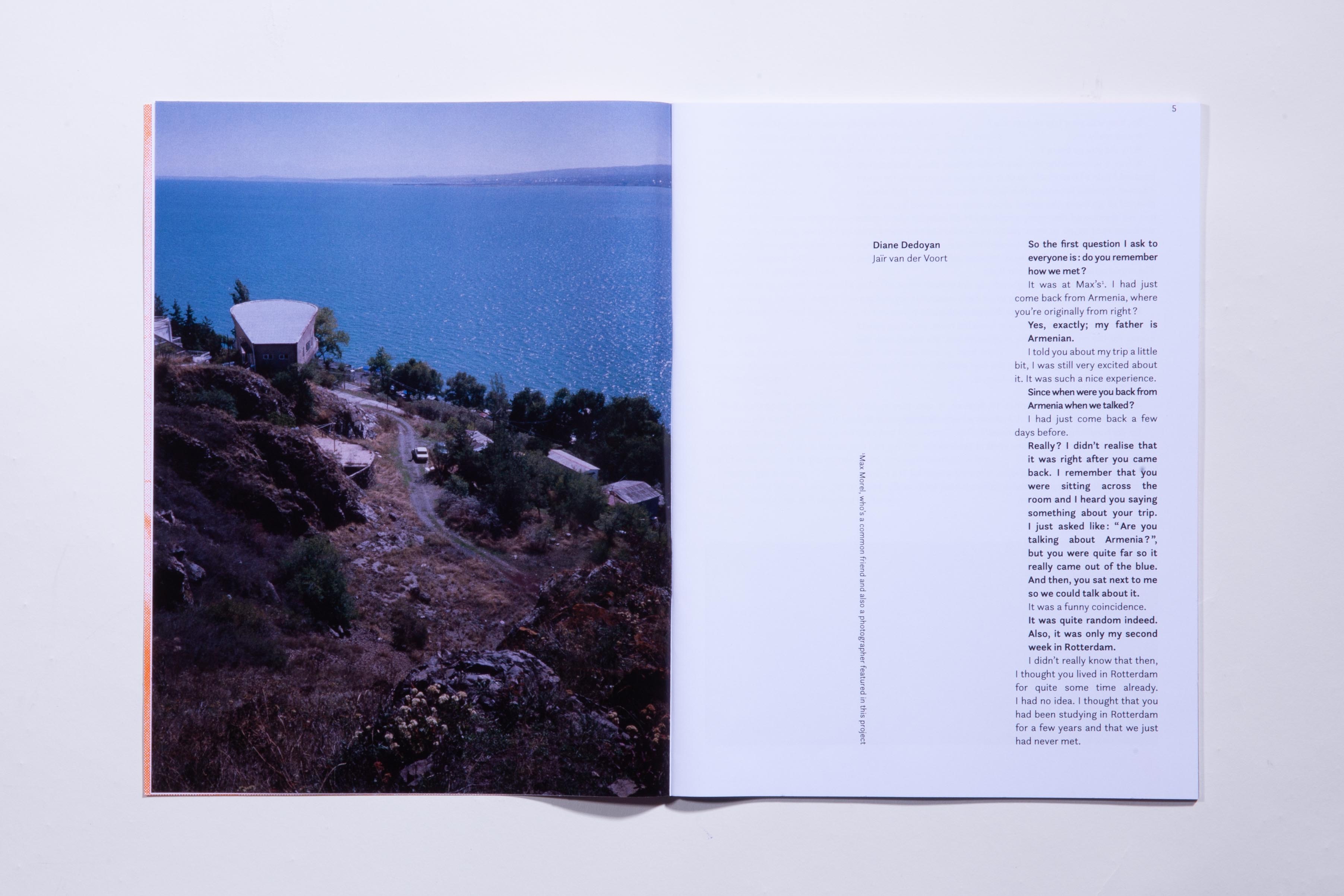
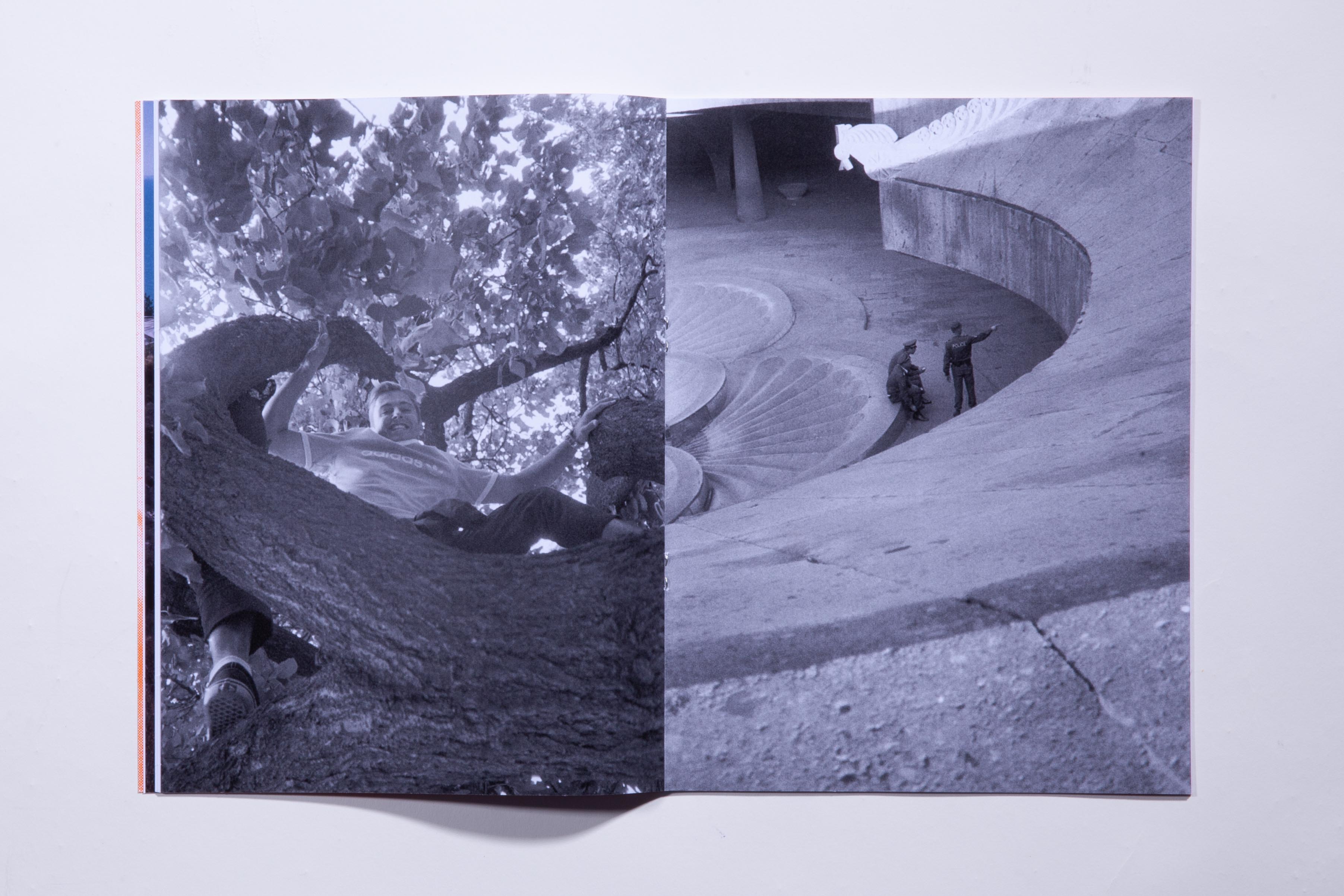
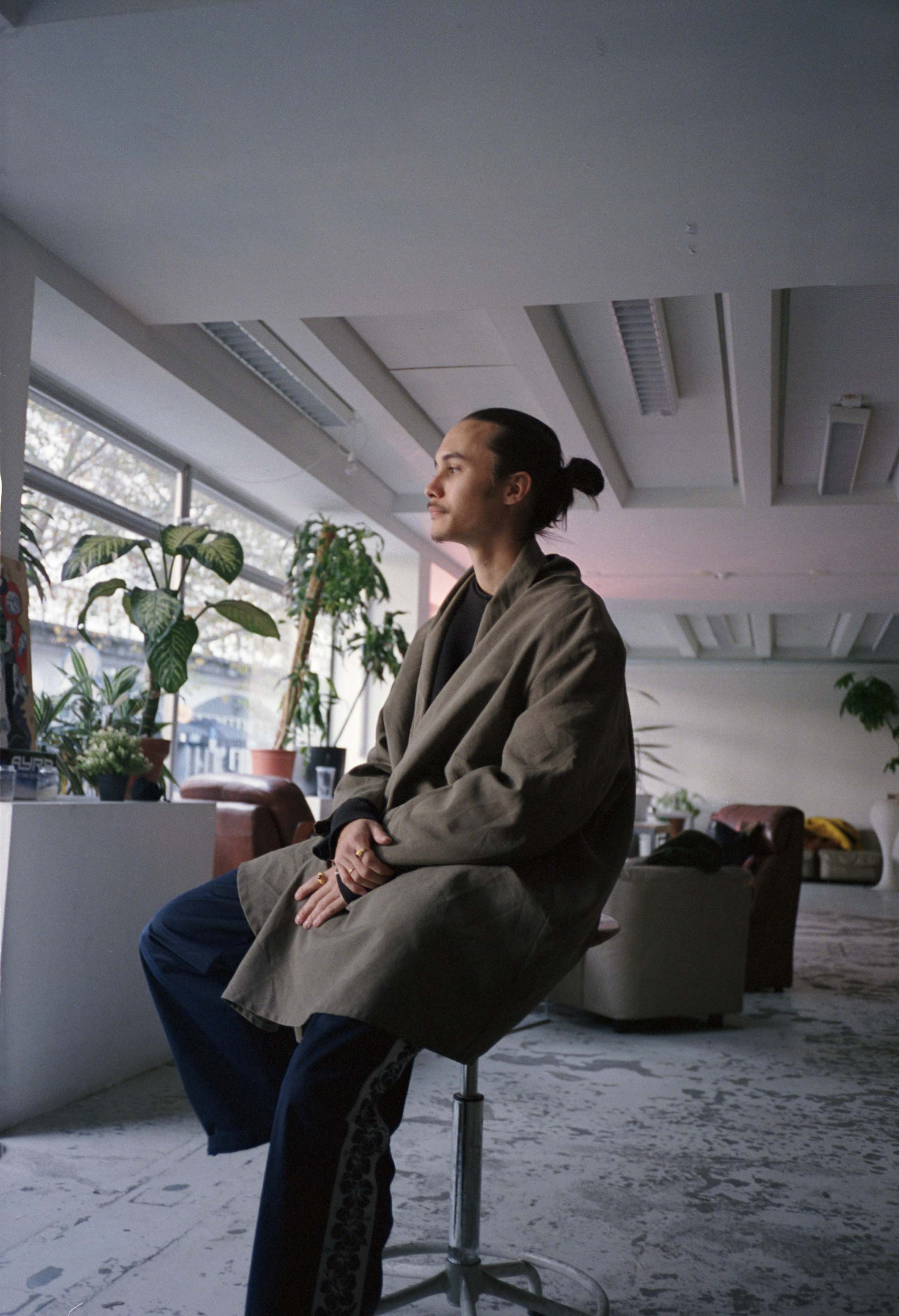
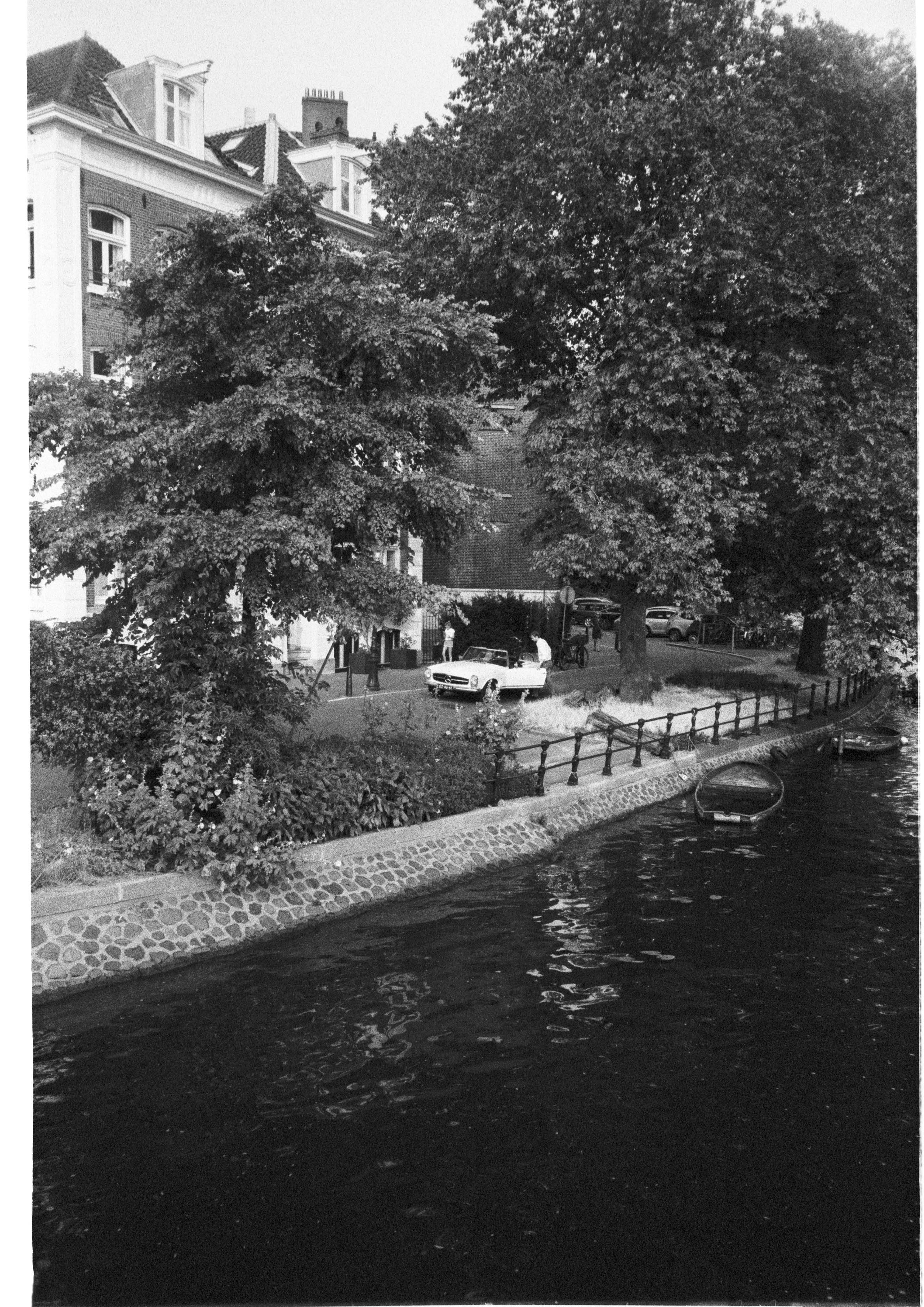
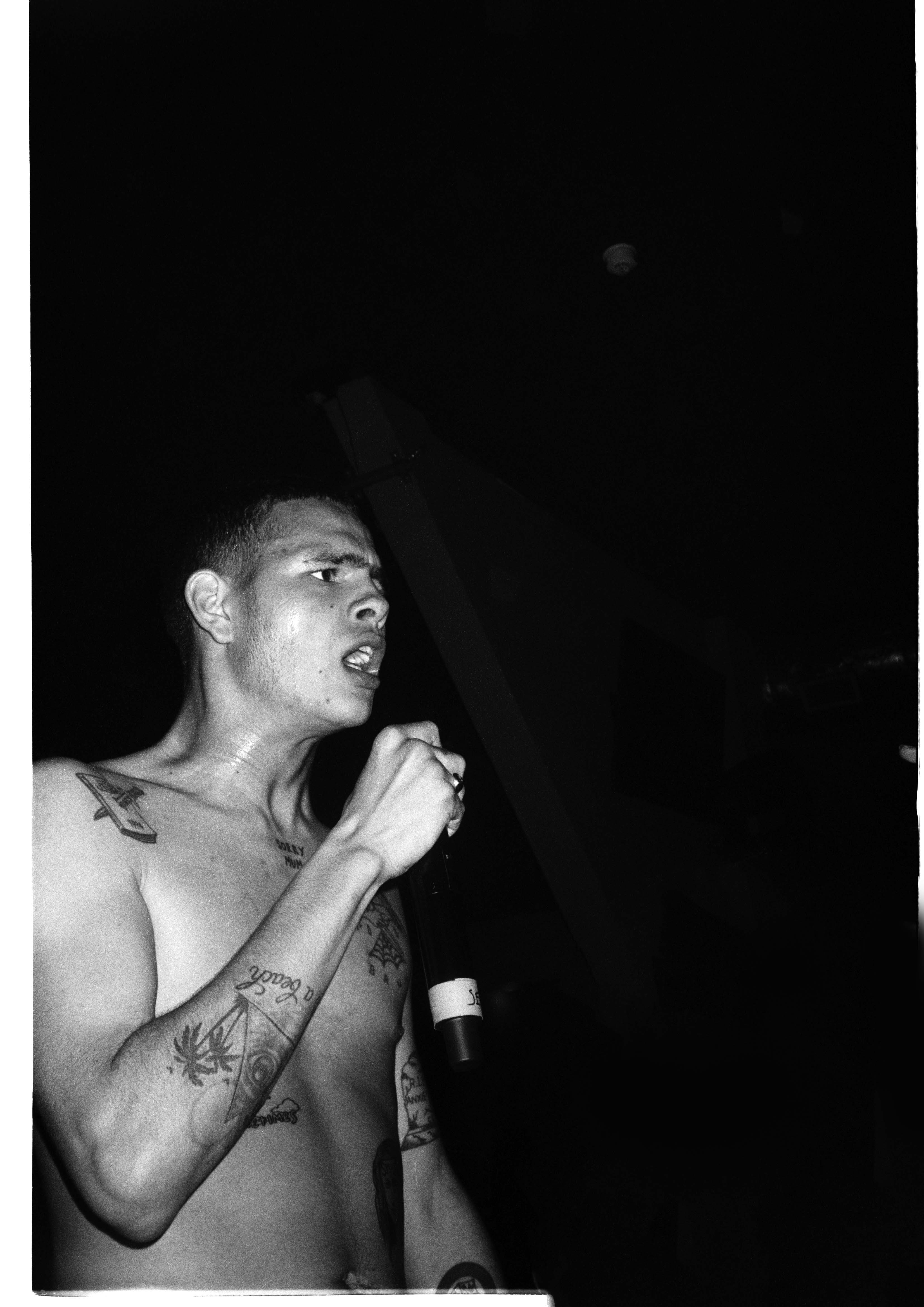
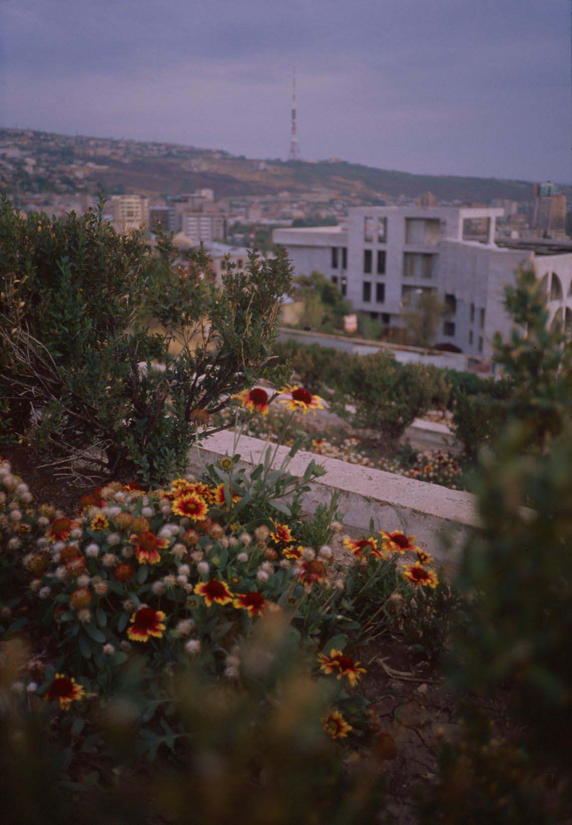
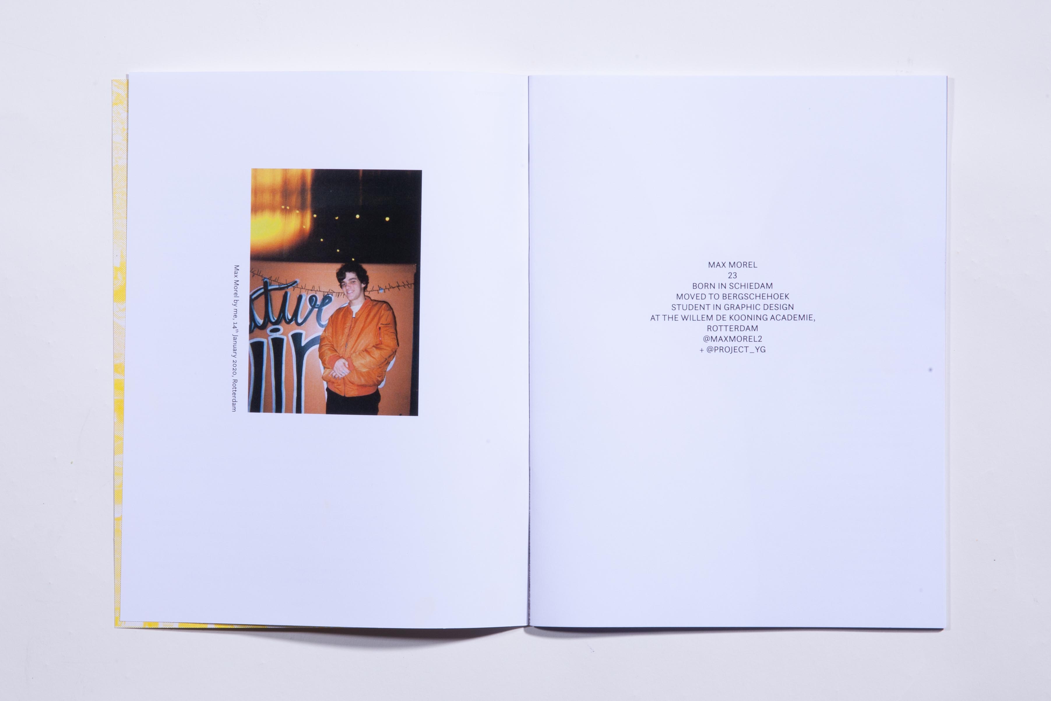
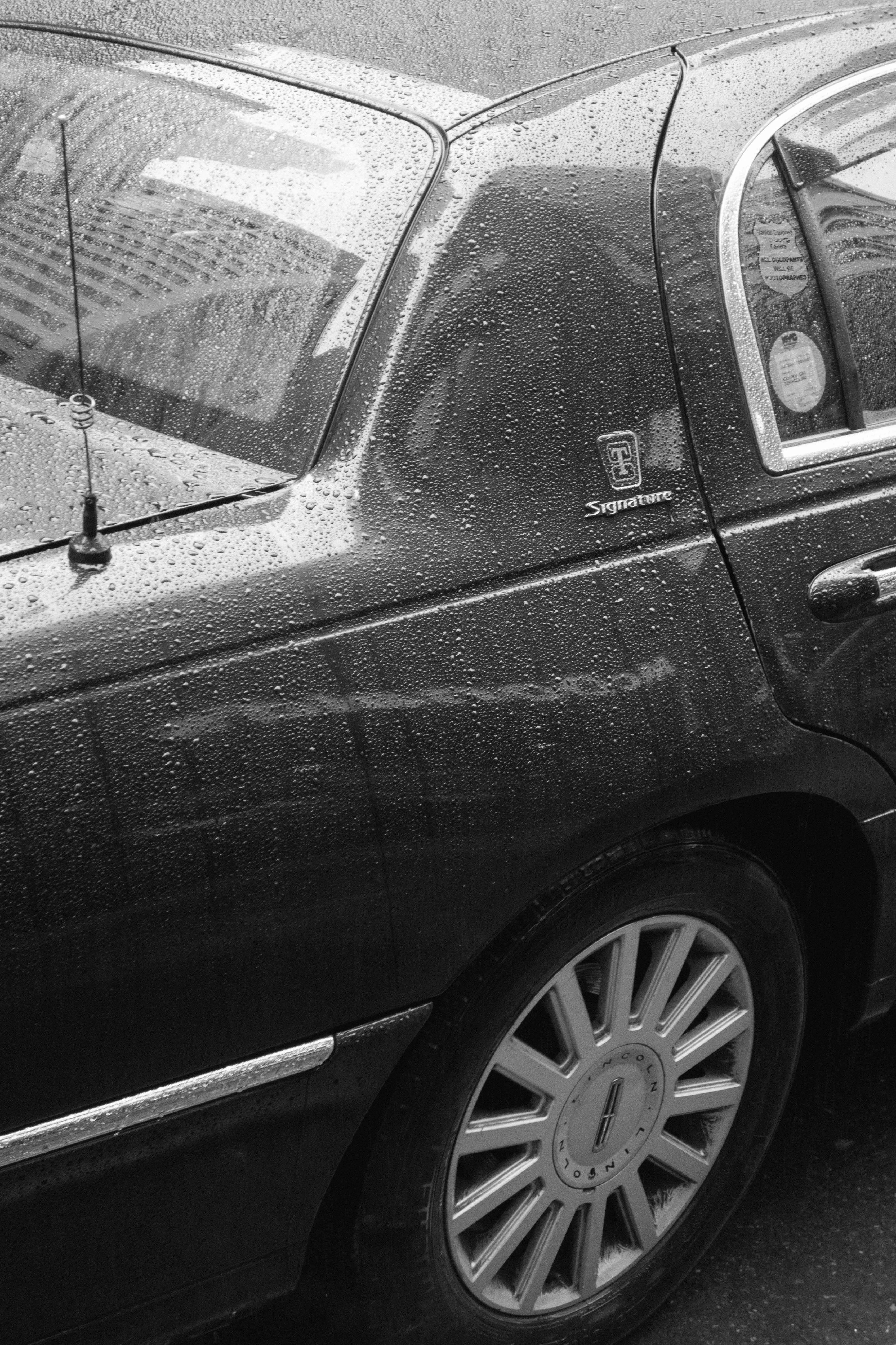
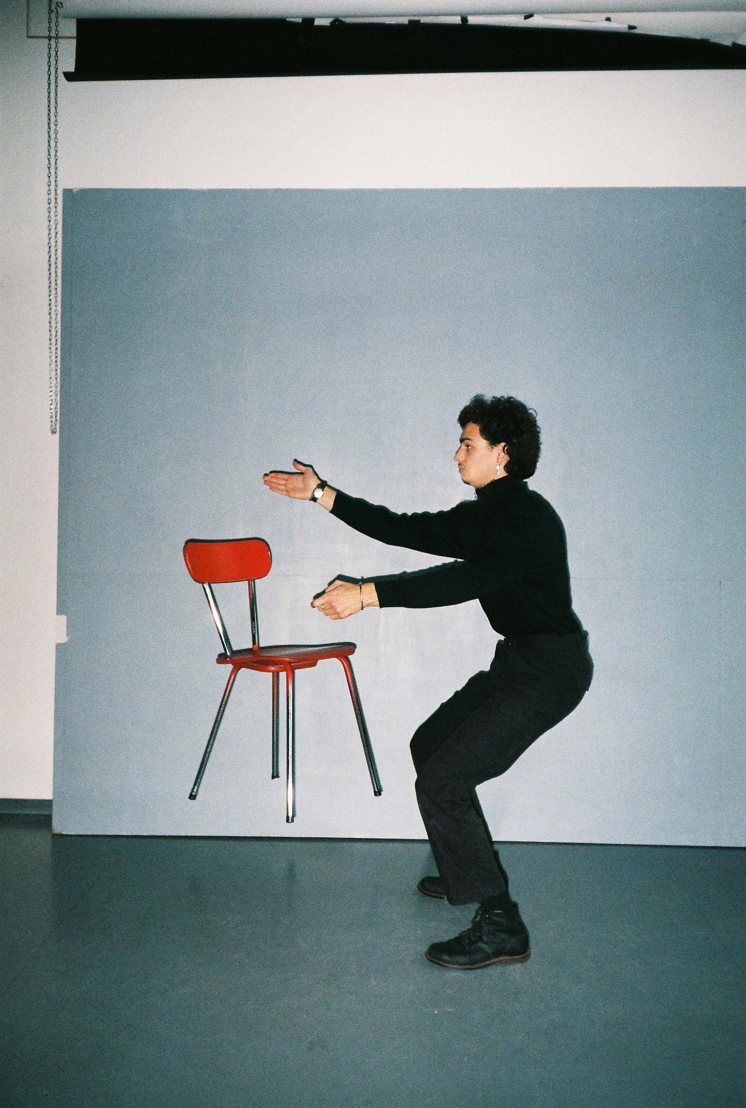
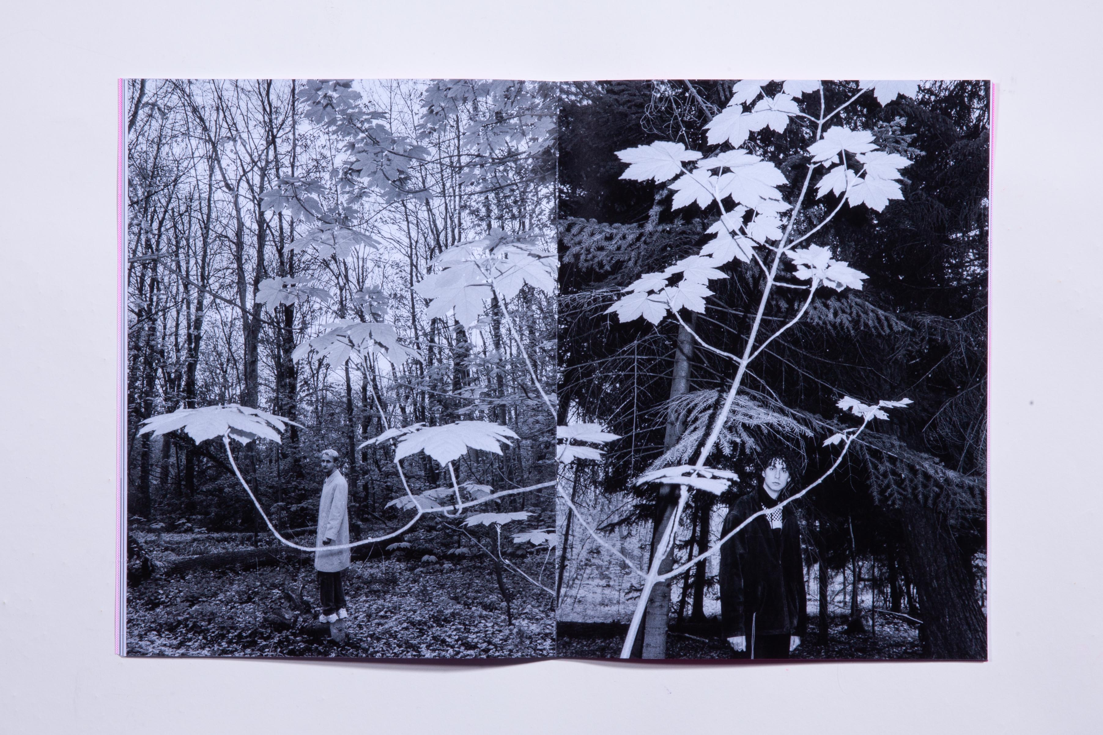
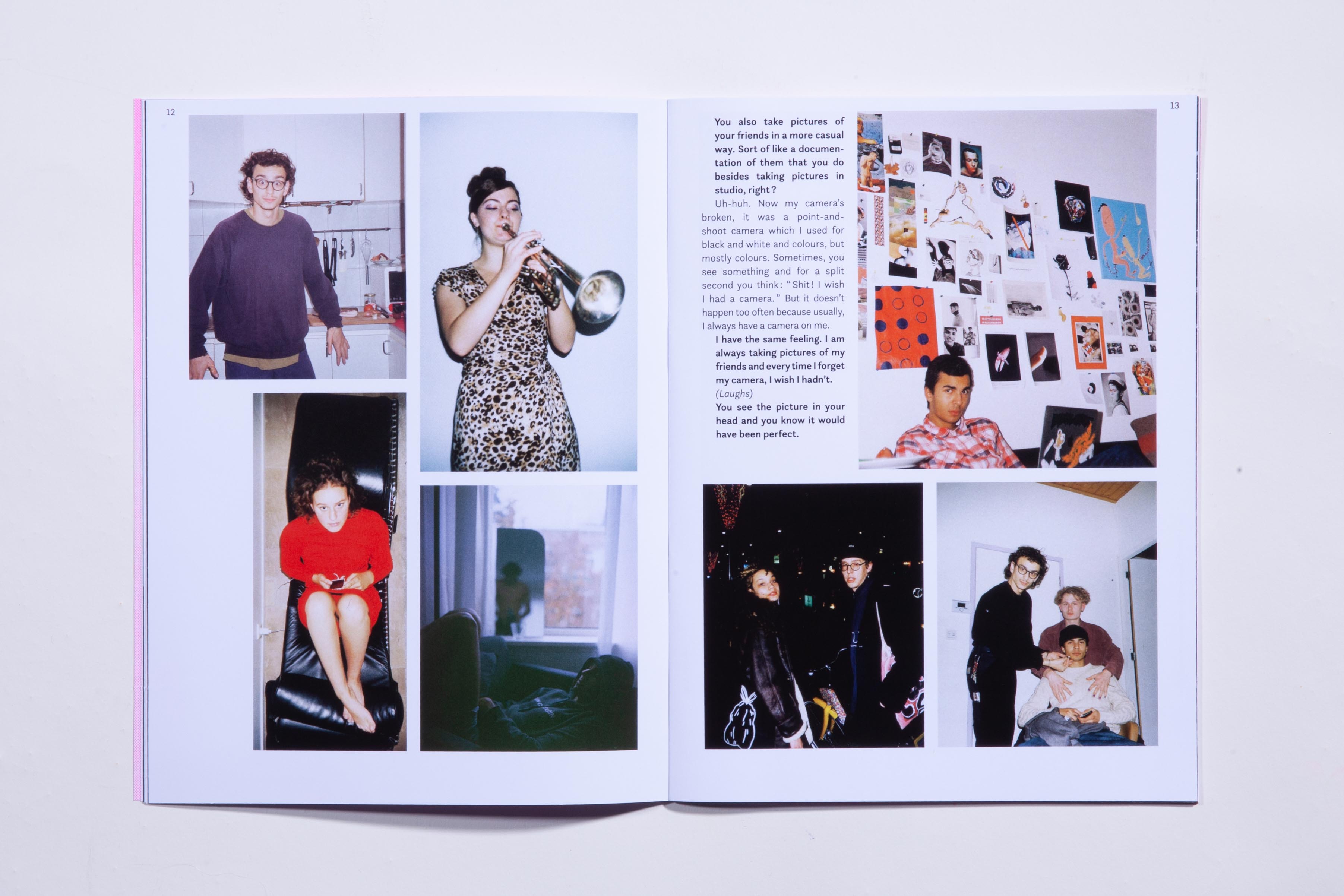
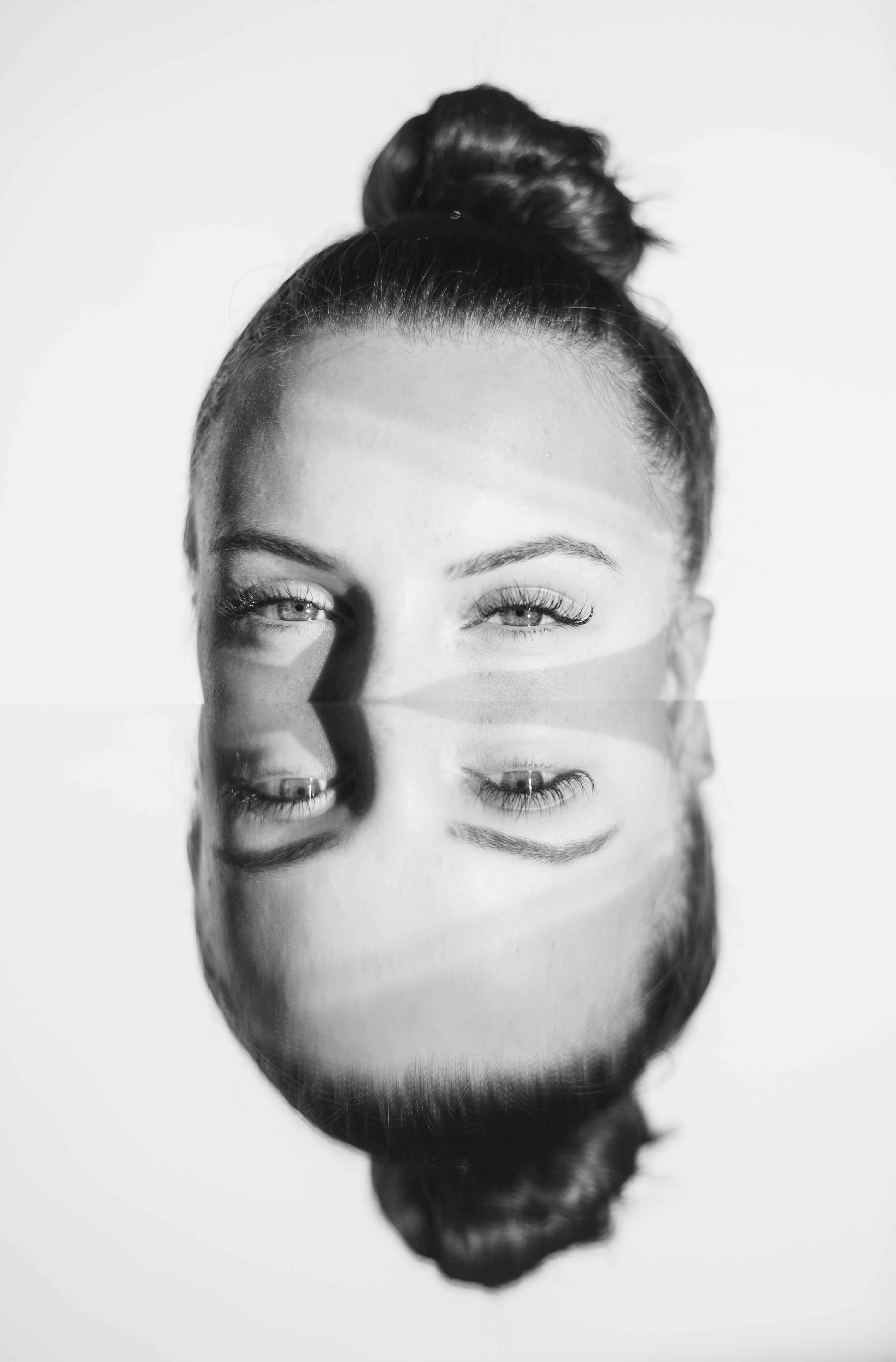
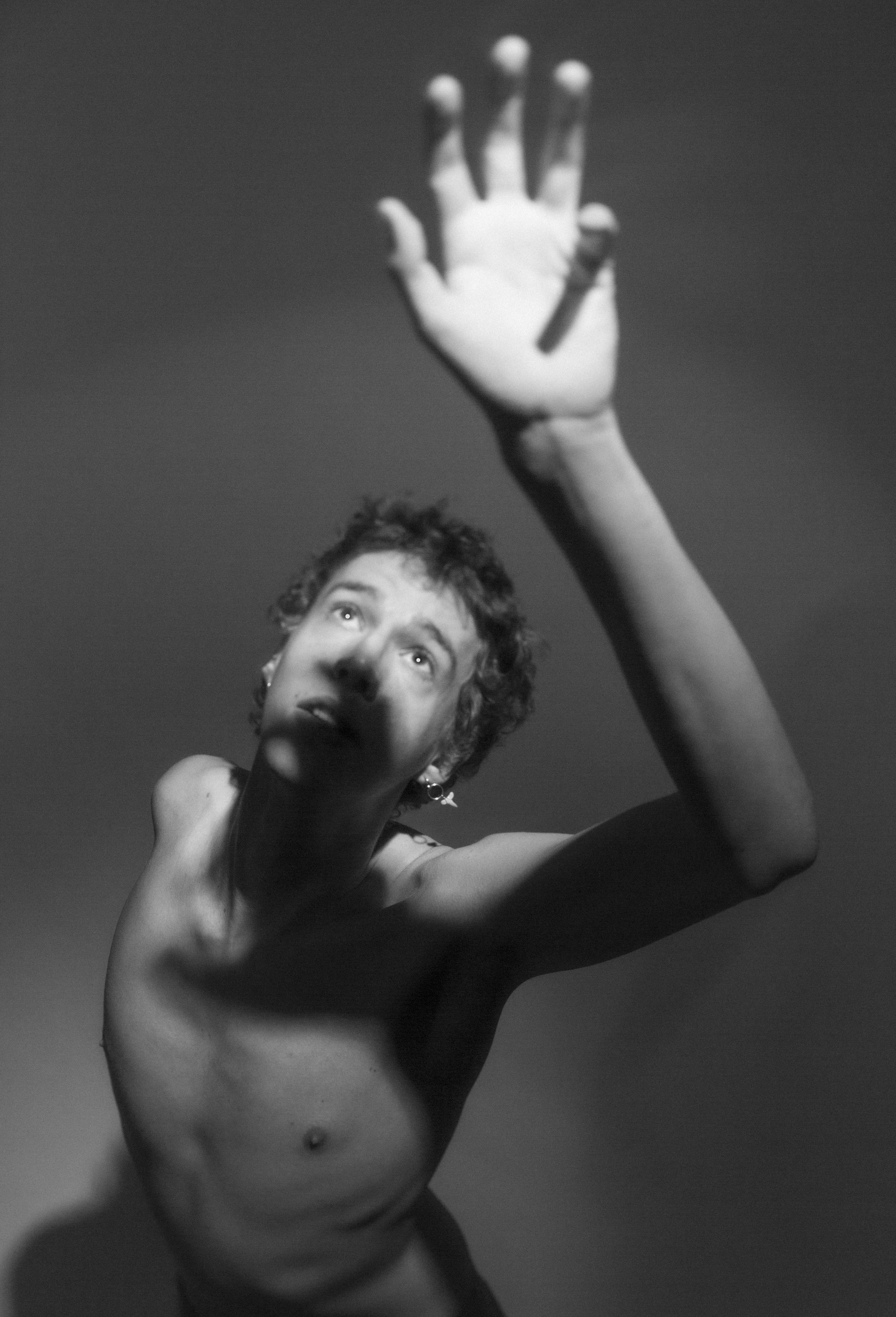
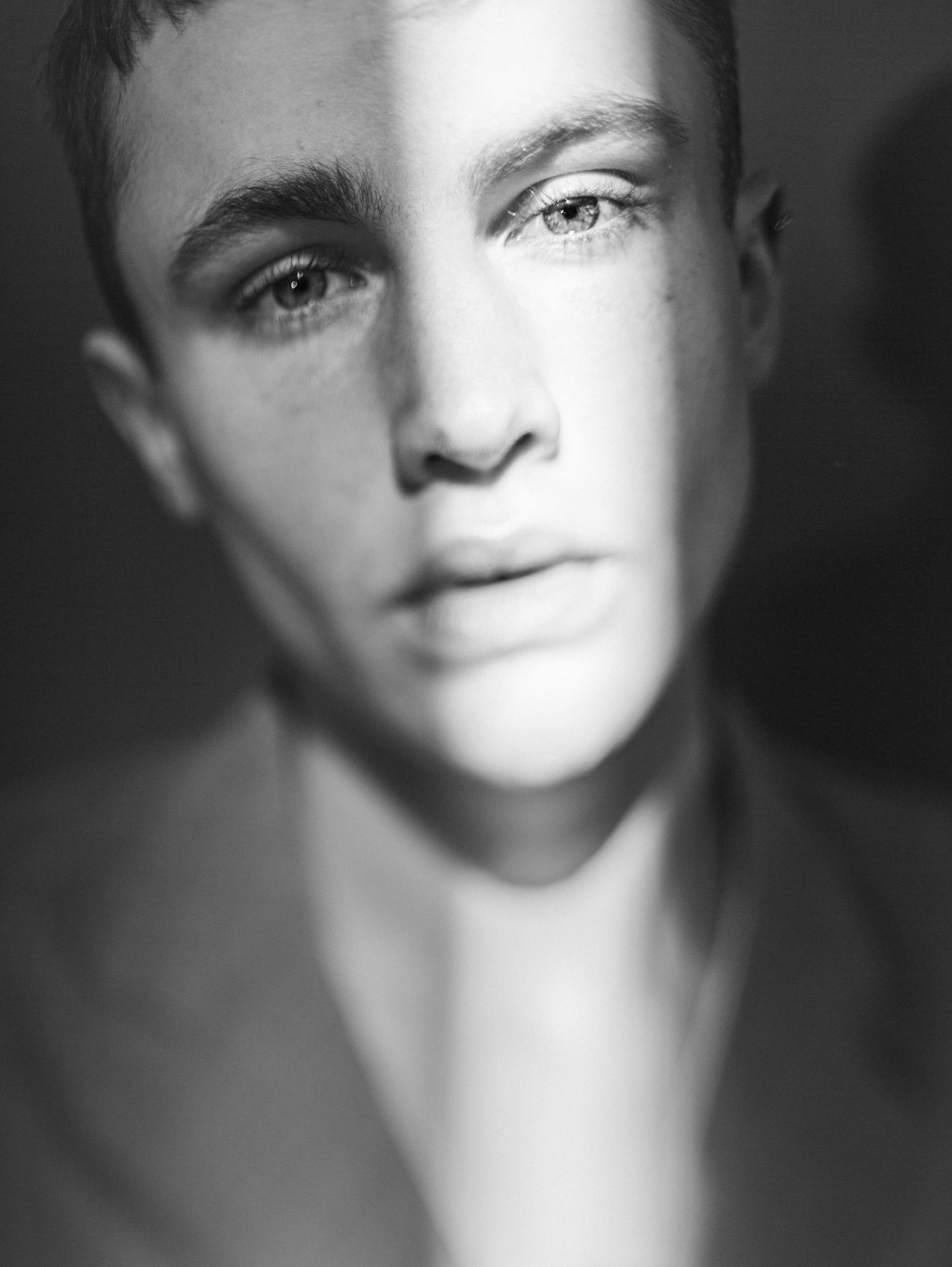
While living there, I made friends with a lot of photographers by chance. I thus decided to interview three of them about our common passion. It was really interesting to learn more about their vision, the way they perceive what surrounds them and to share our anecdotes and techniques.
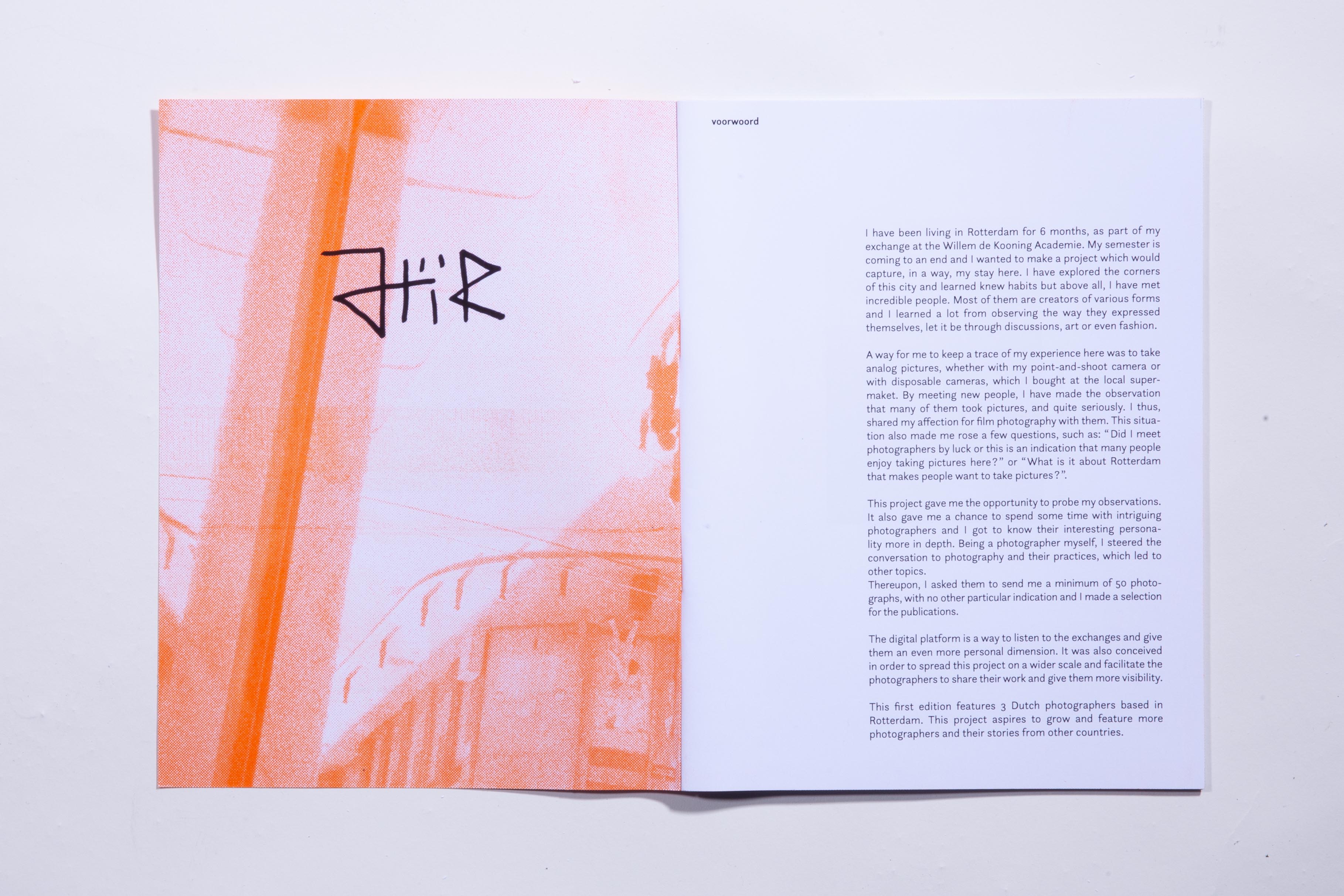
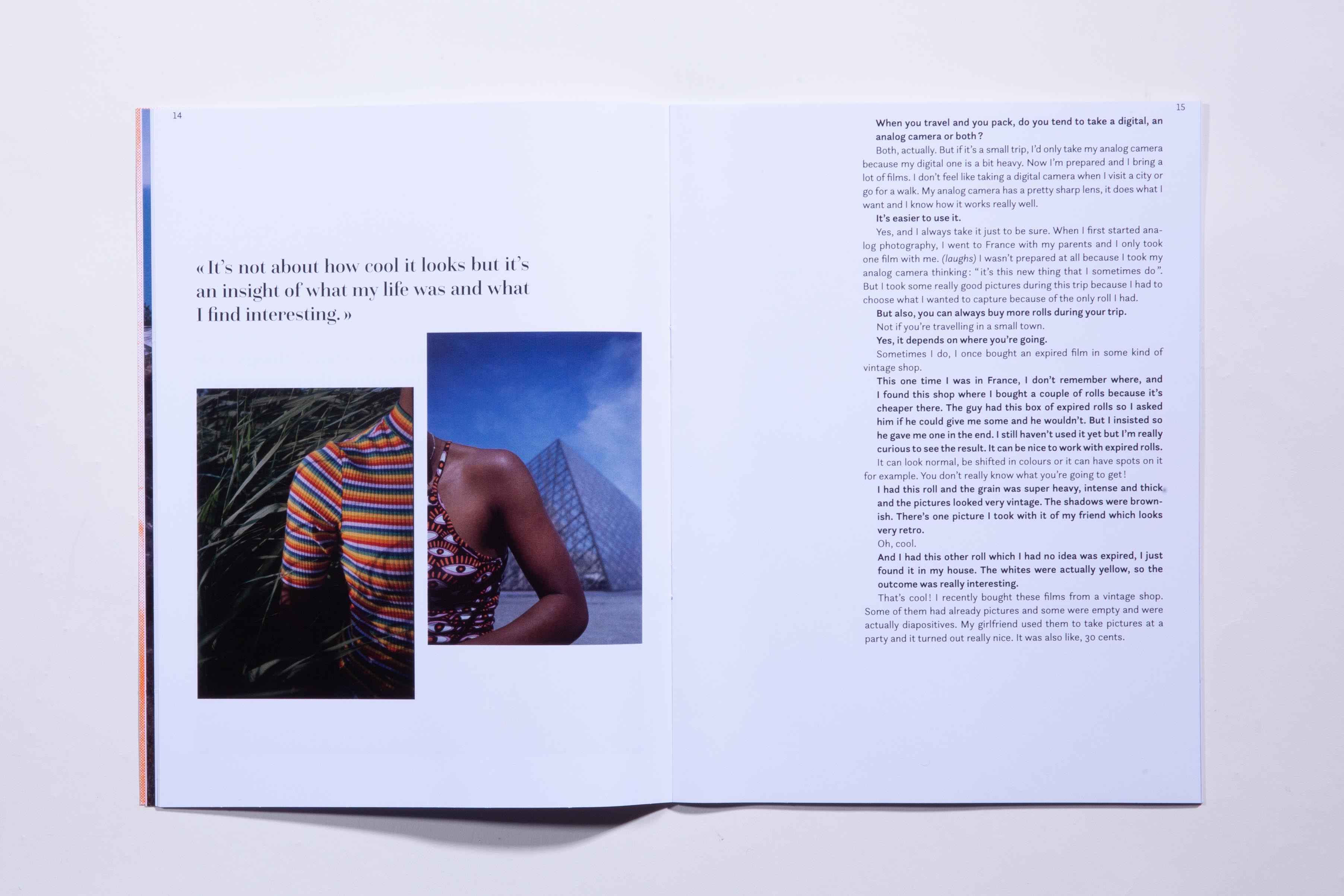
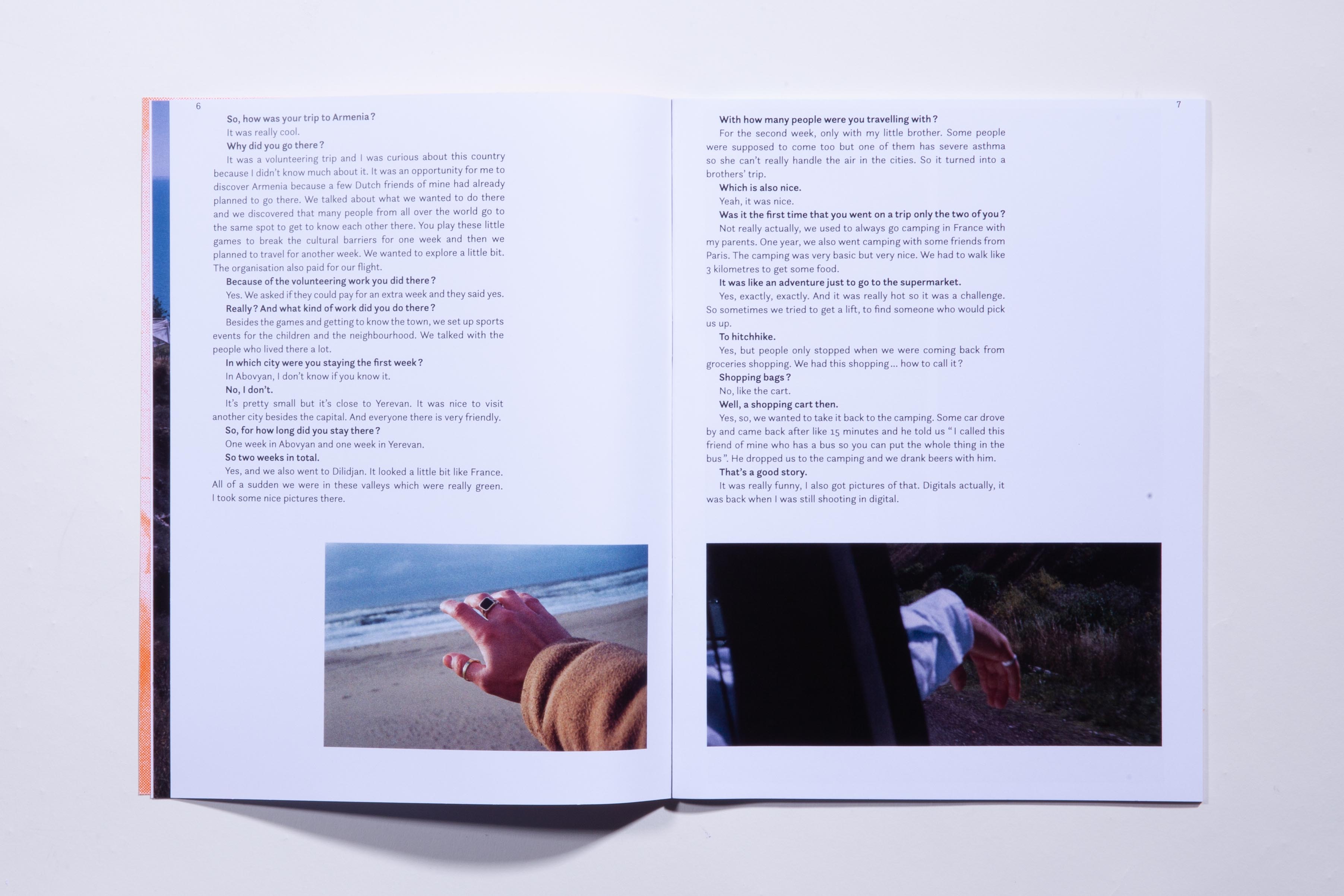
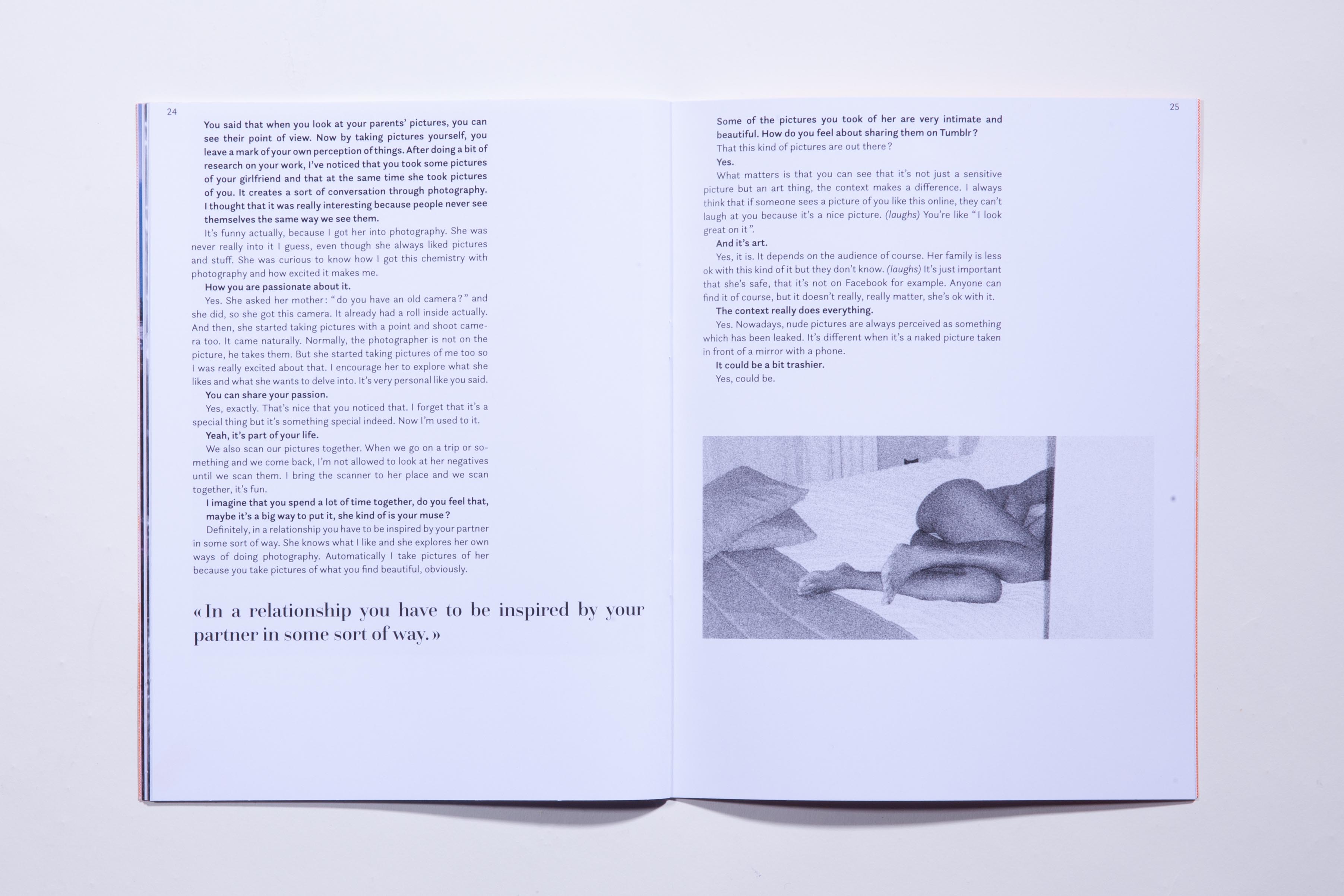
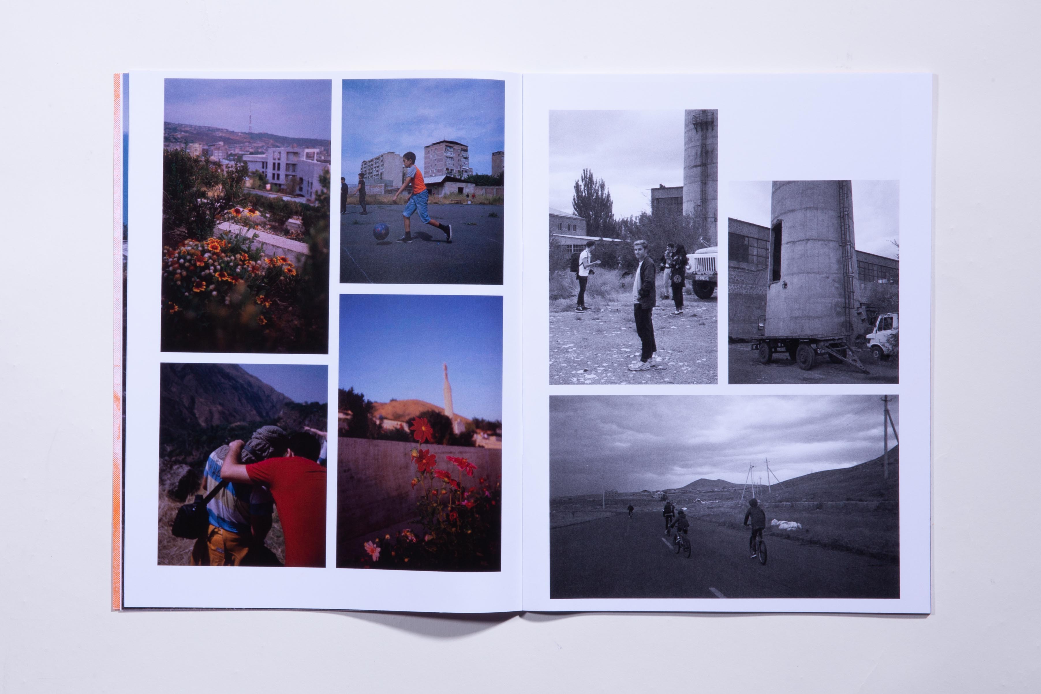
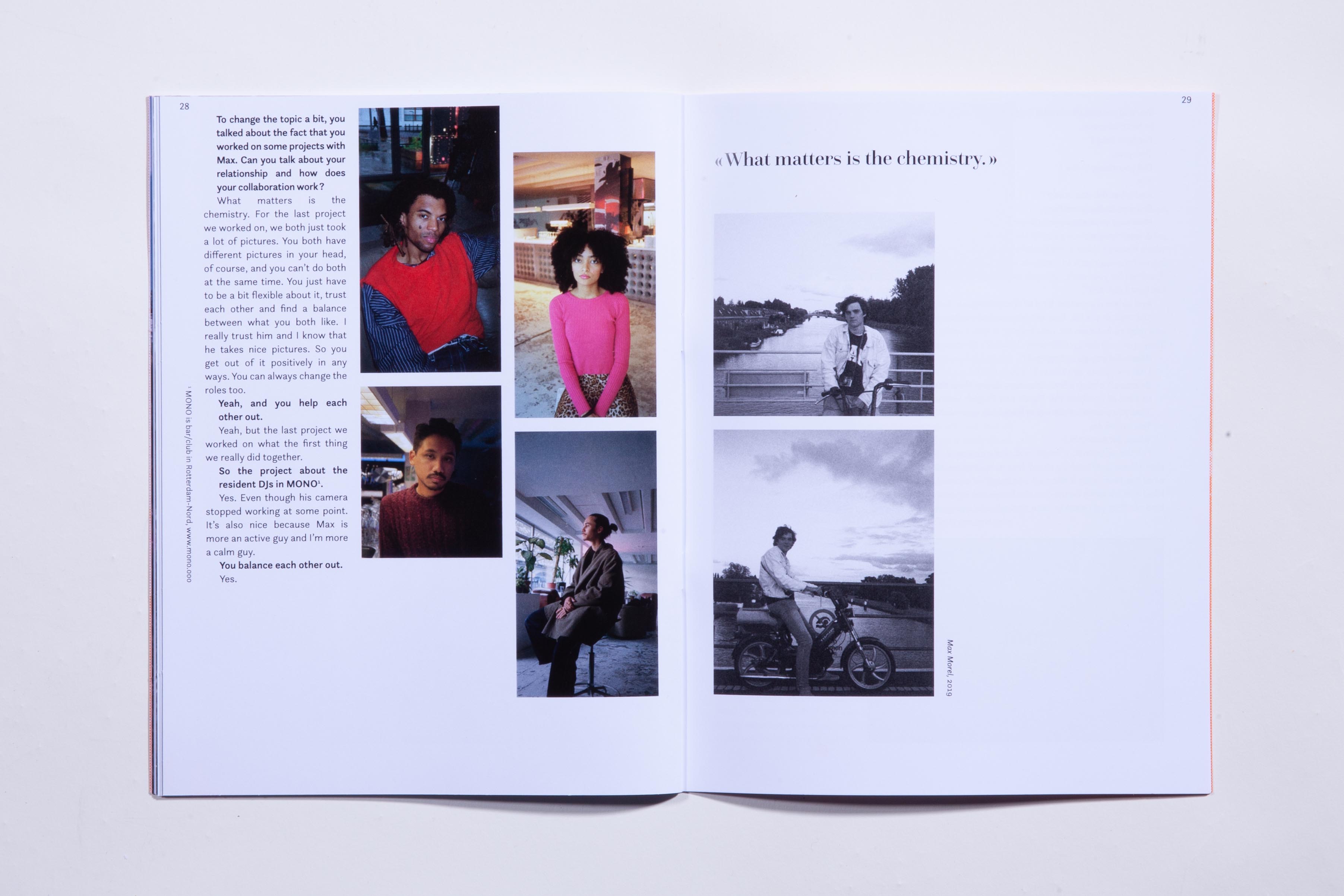
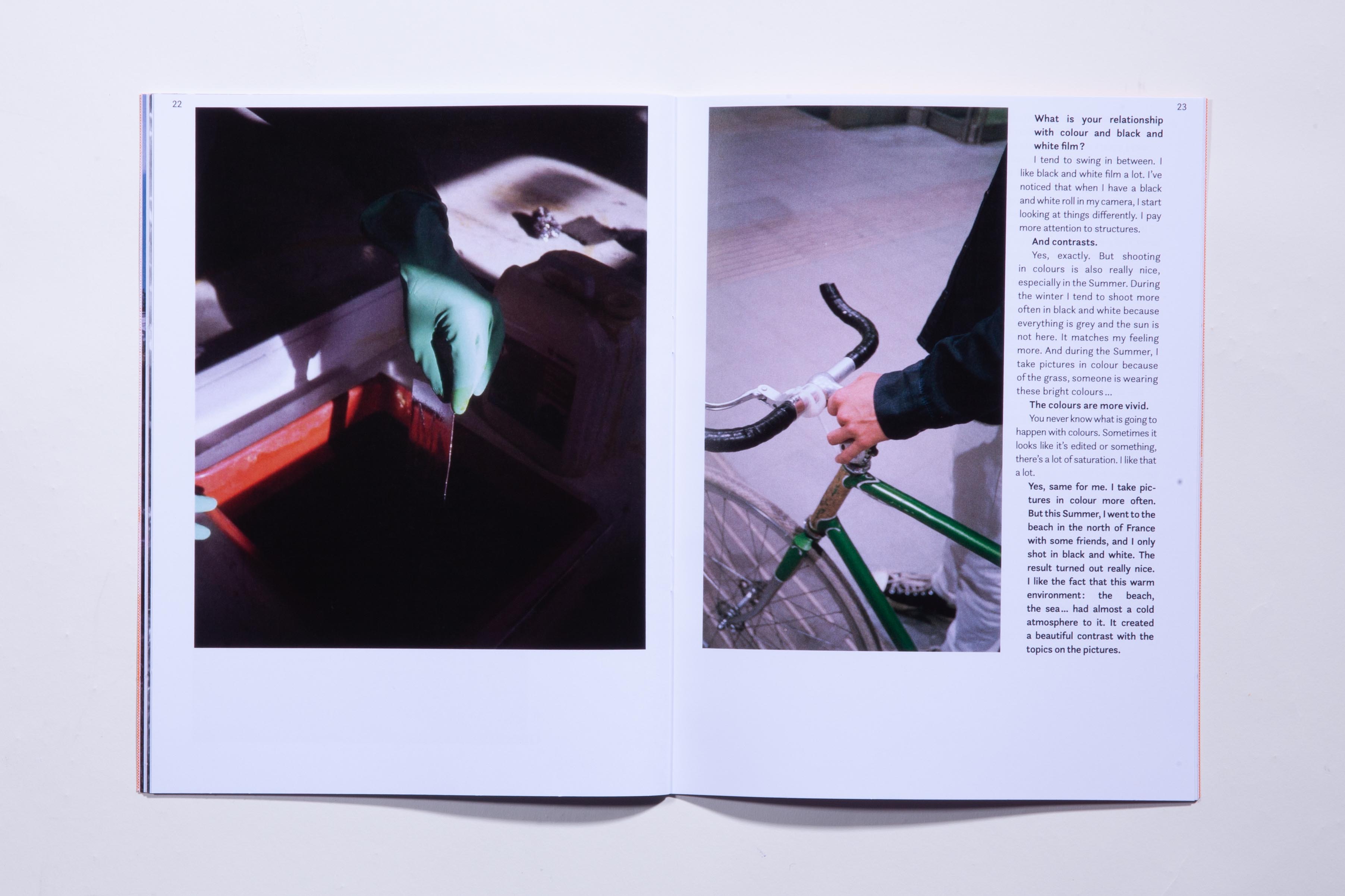
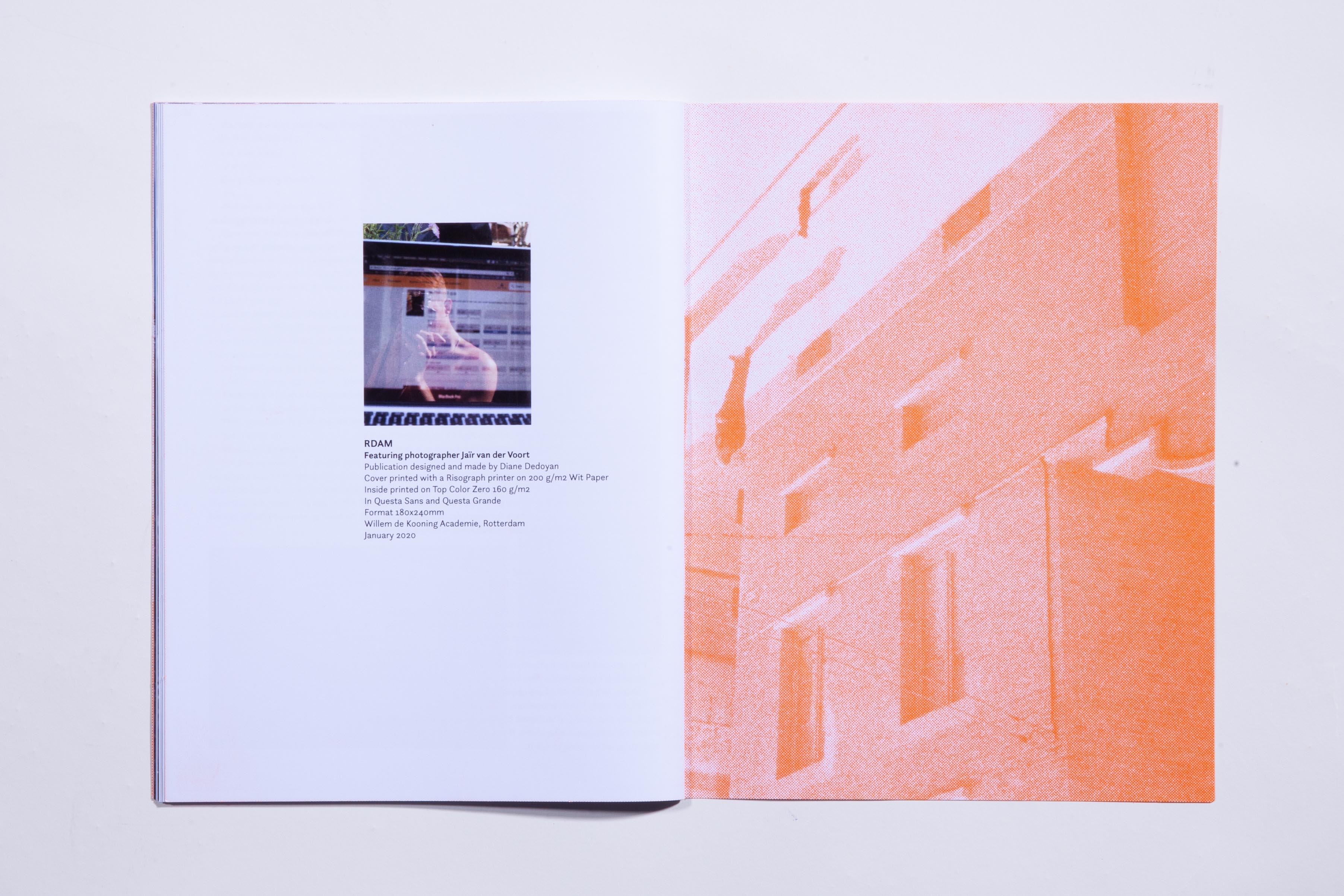
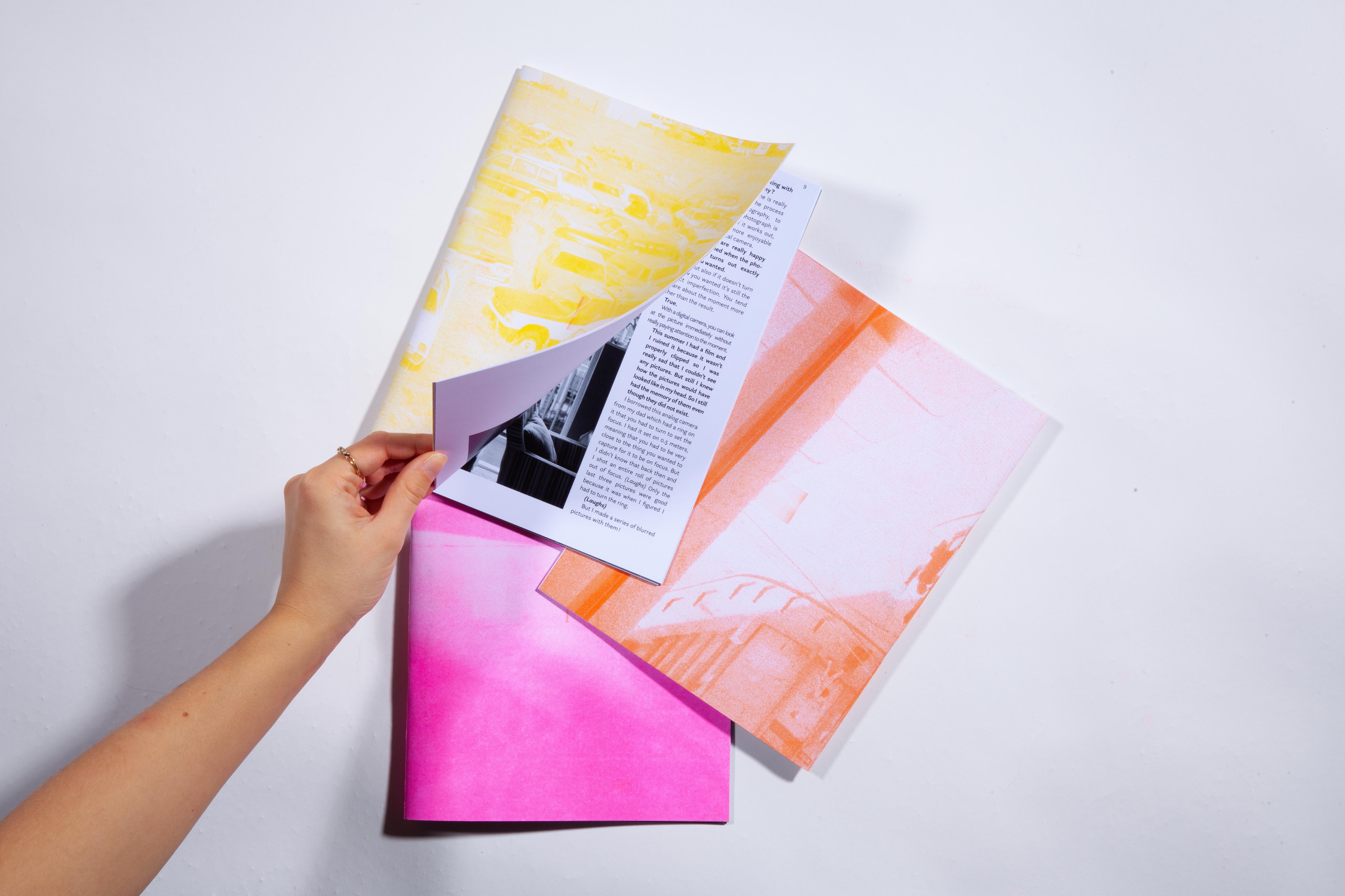
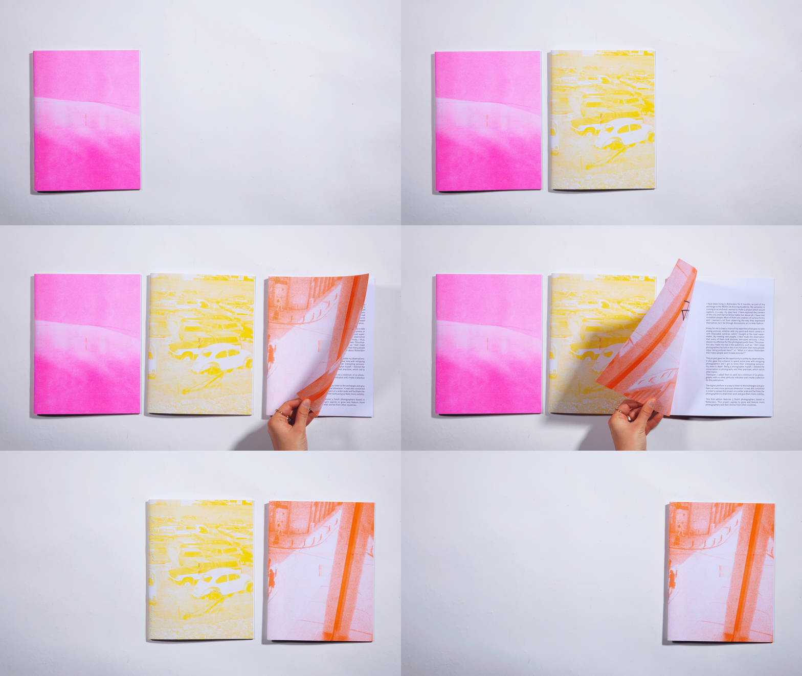
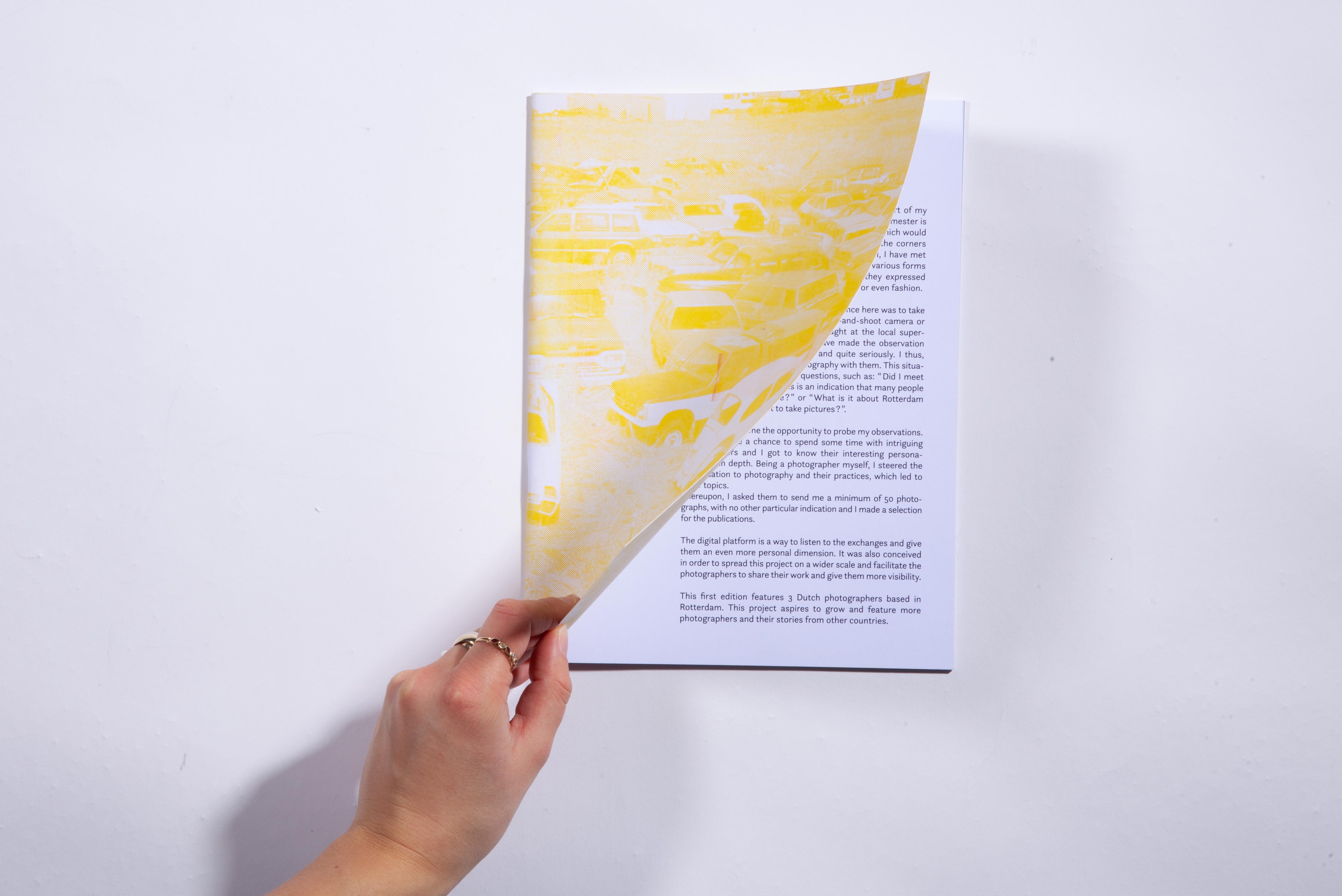
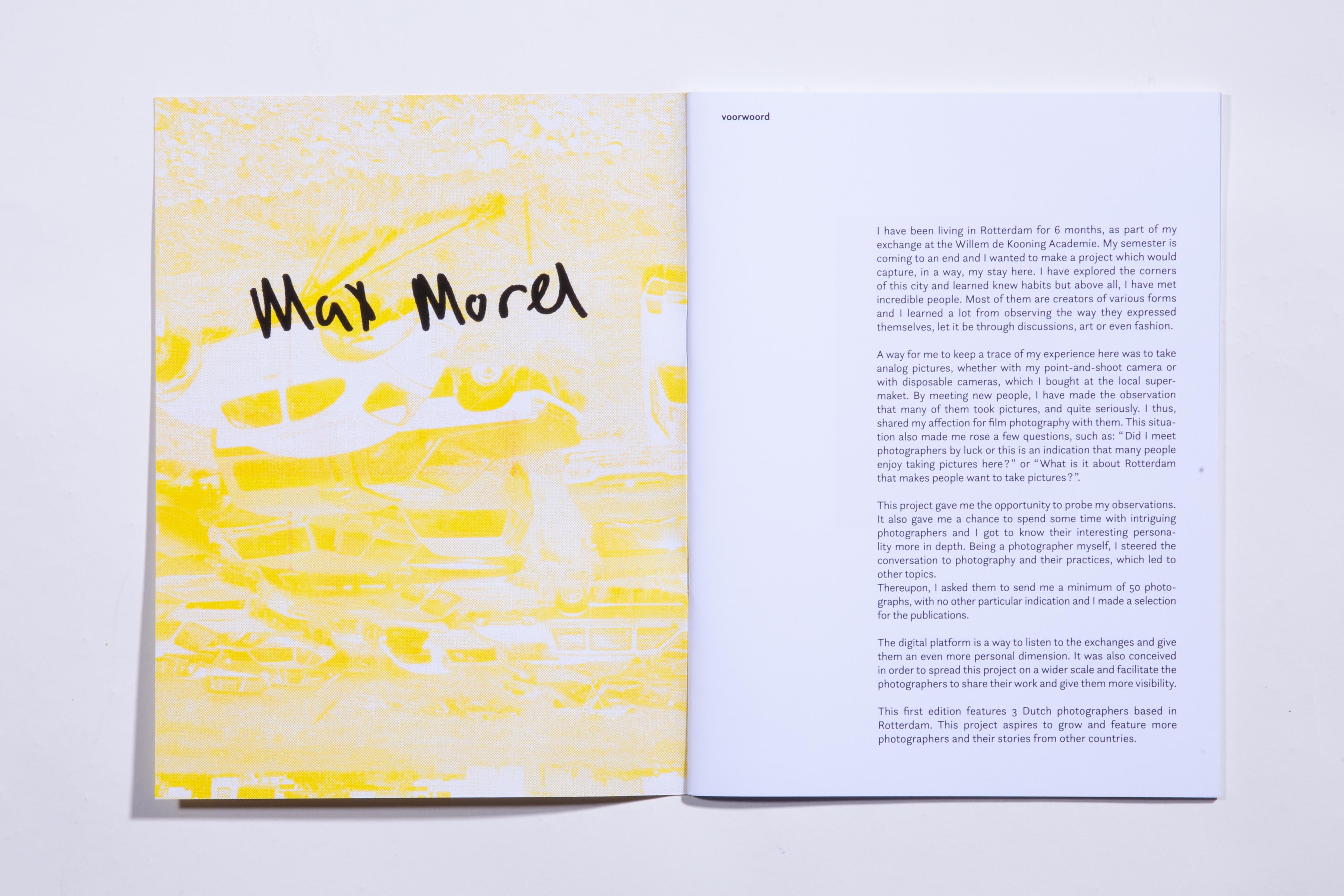
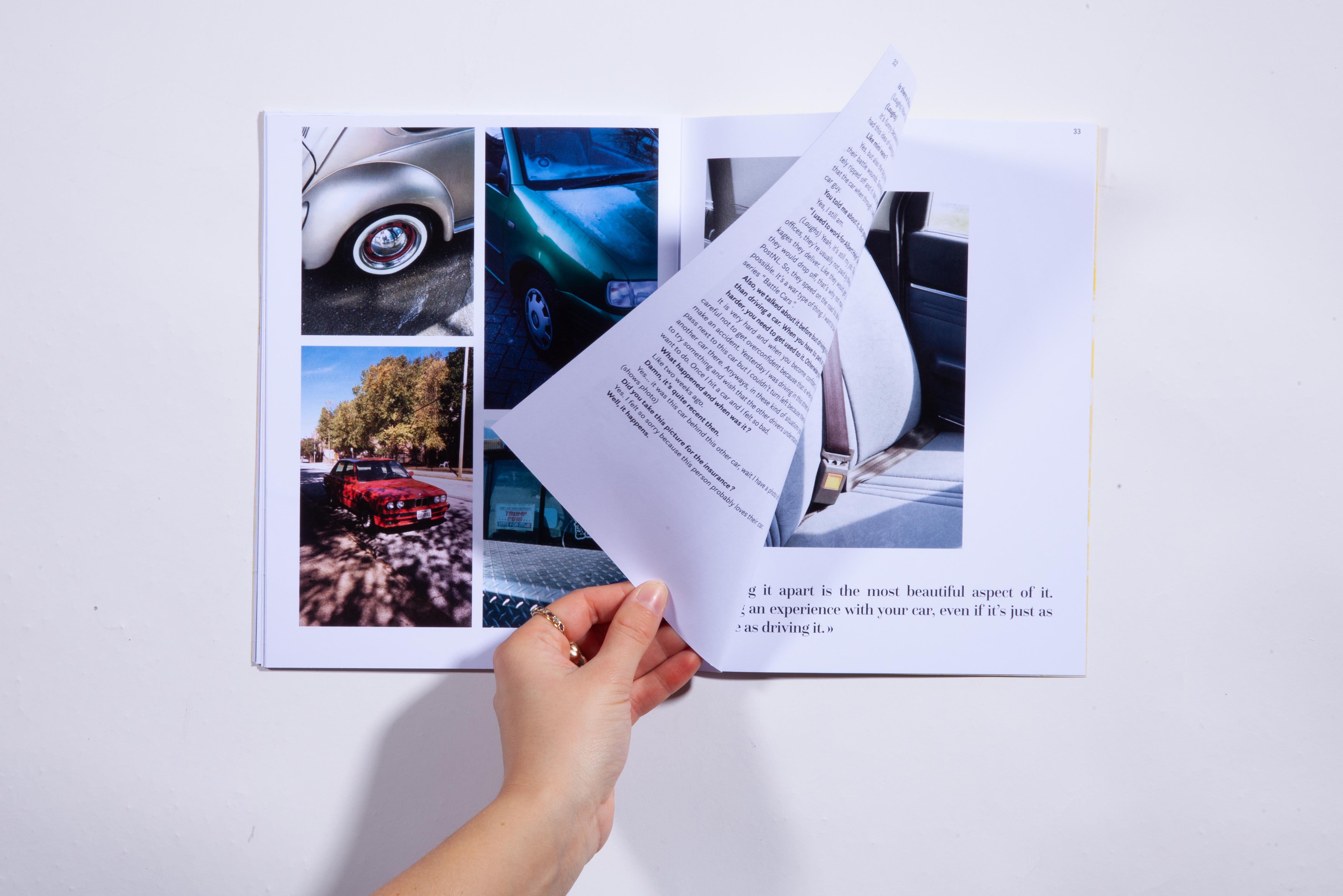
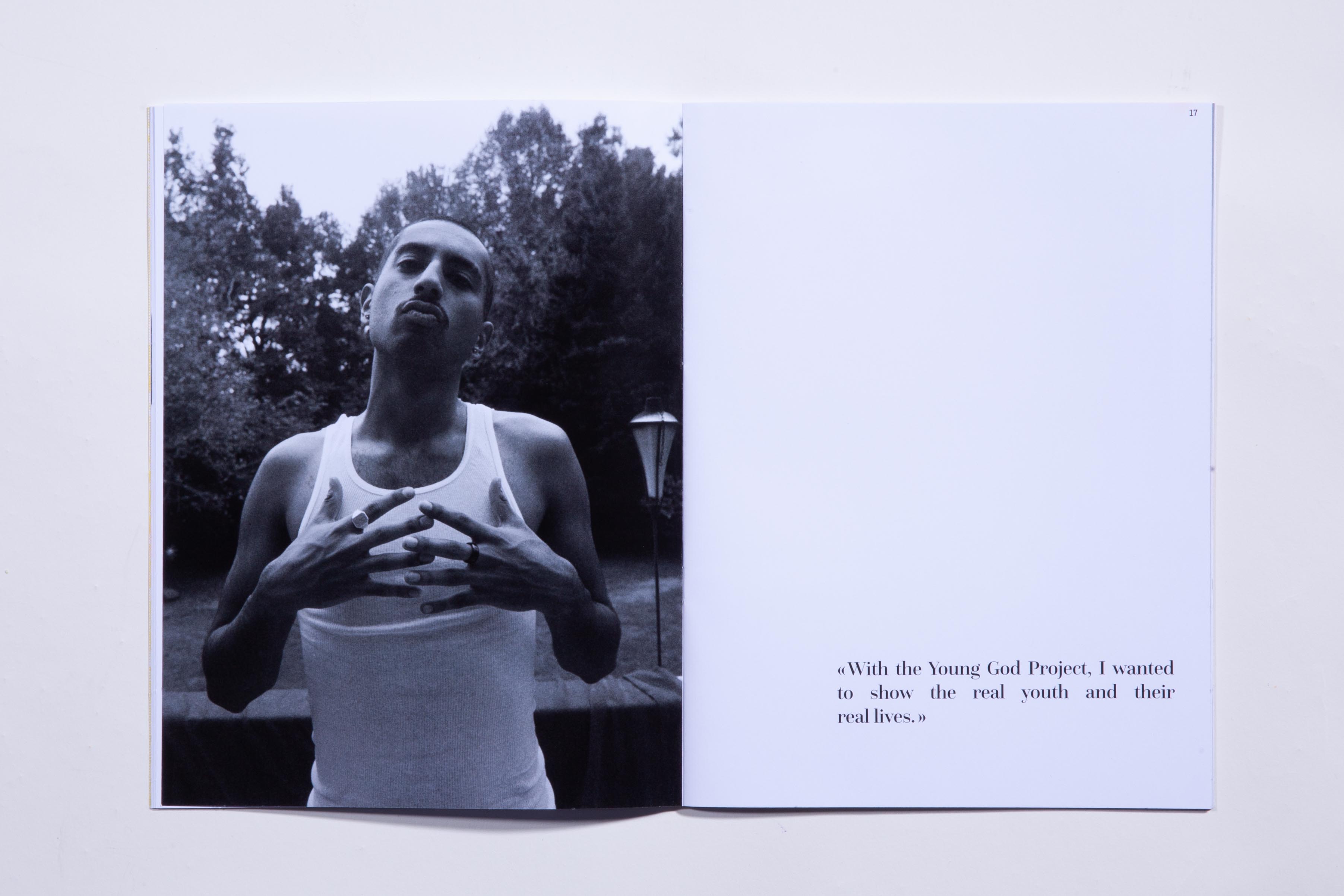
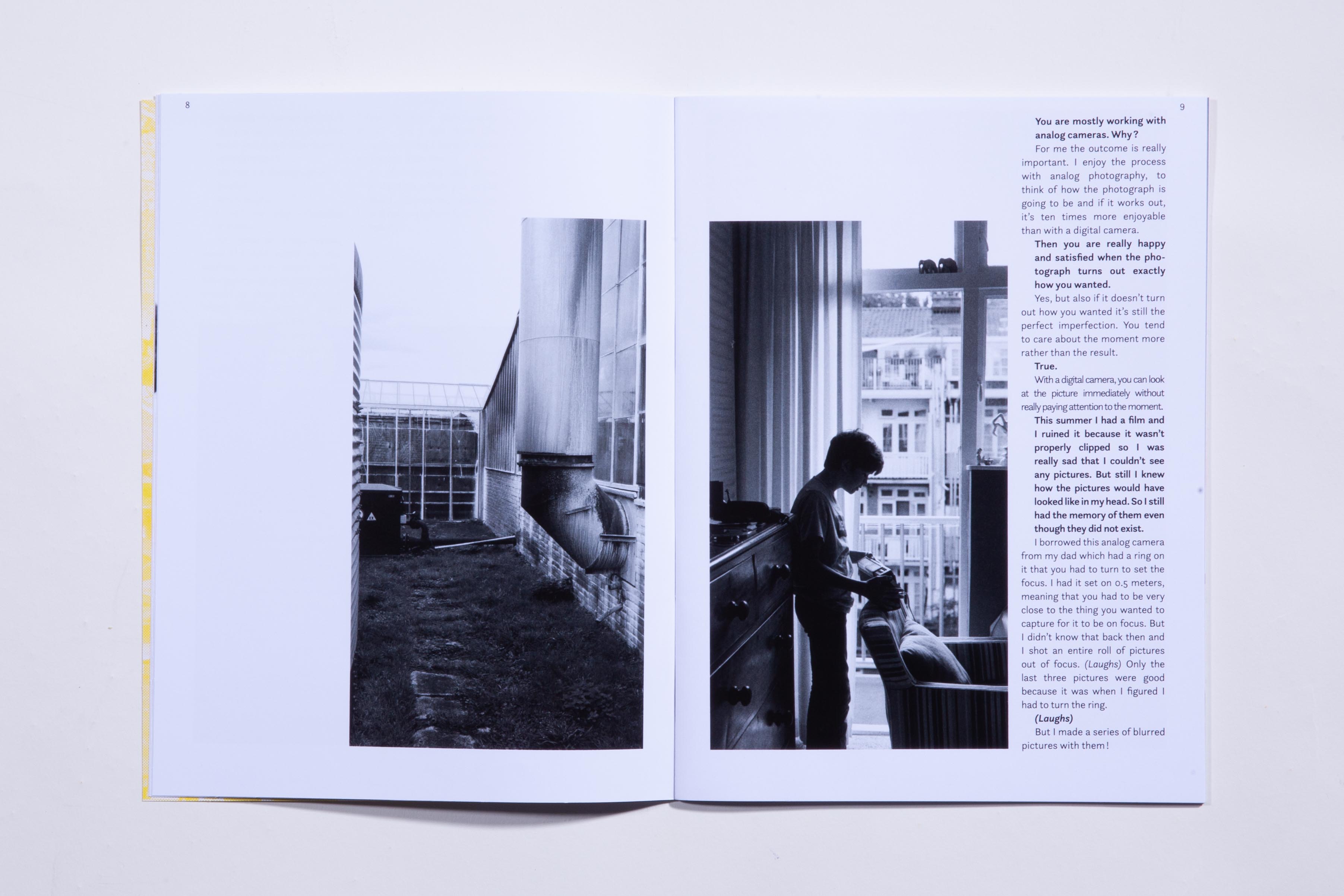
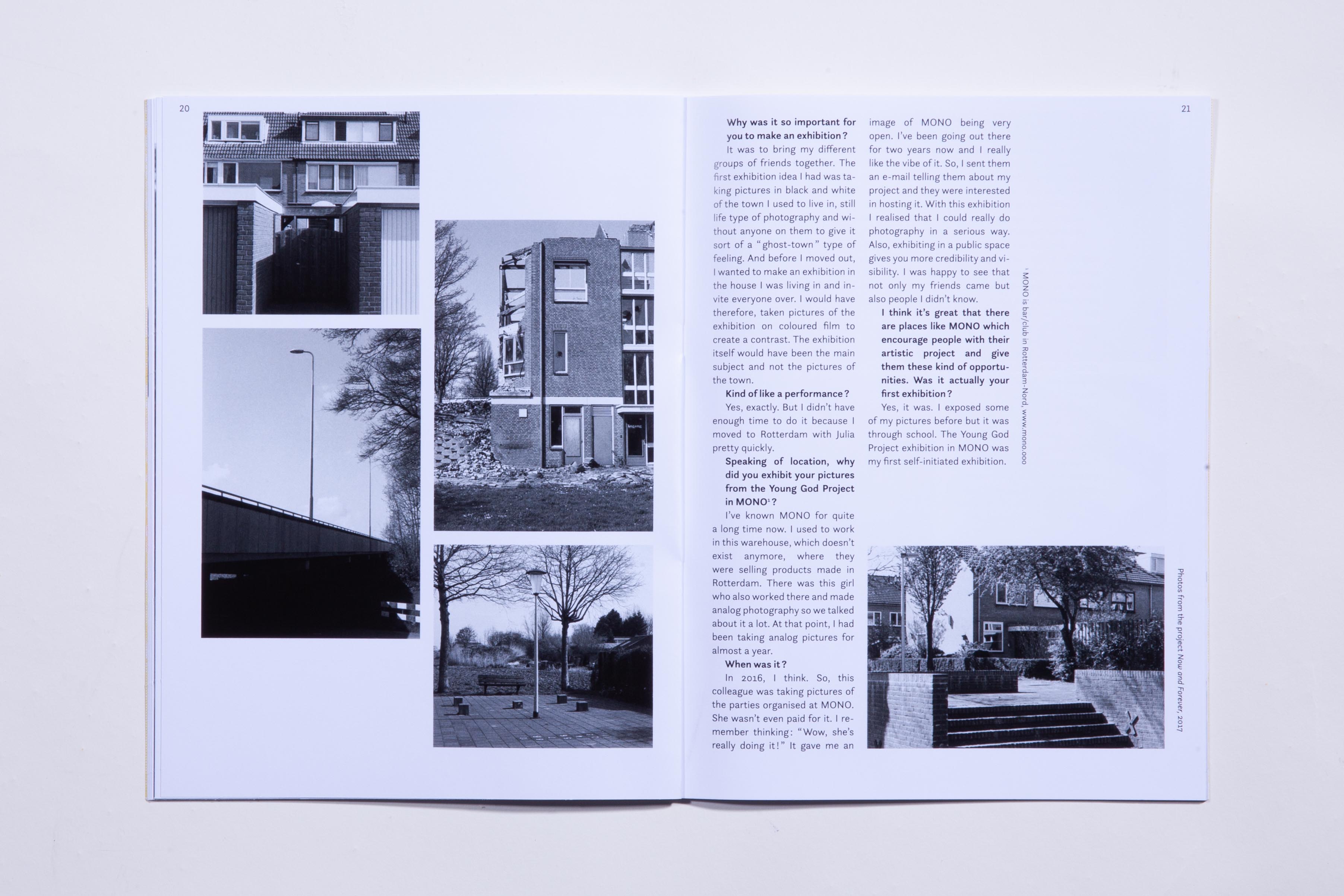
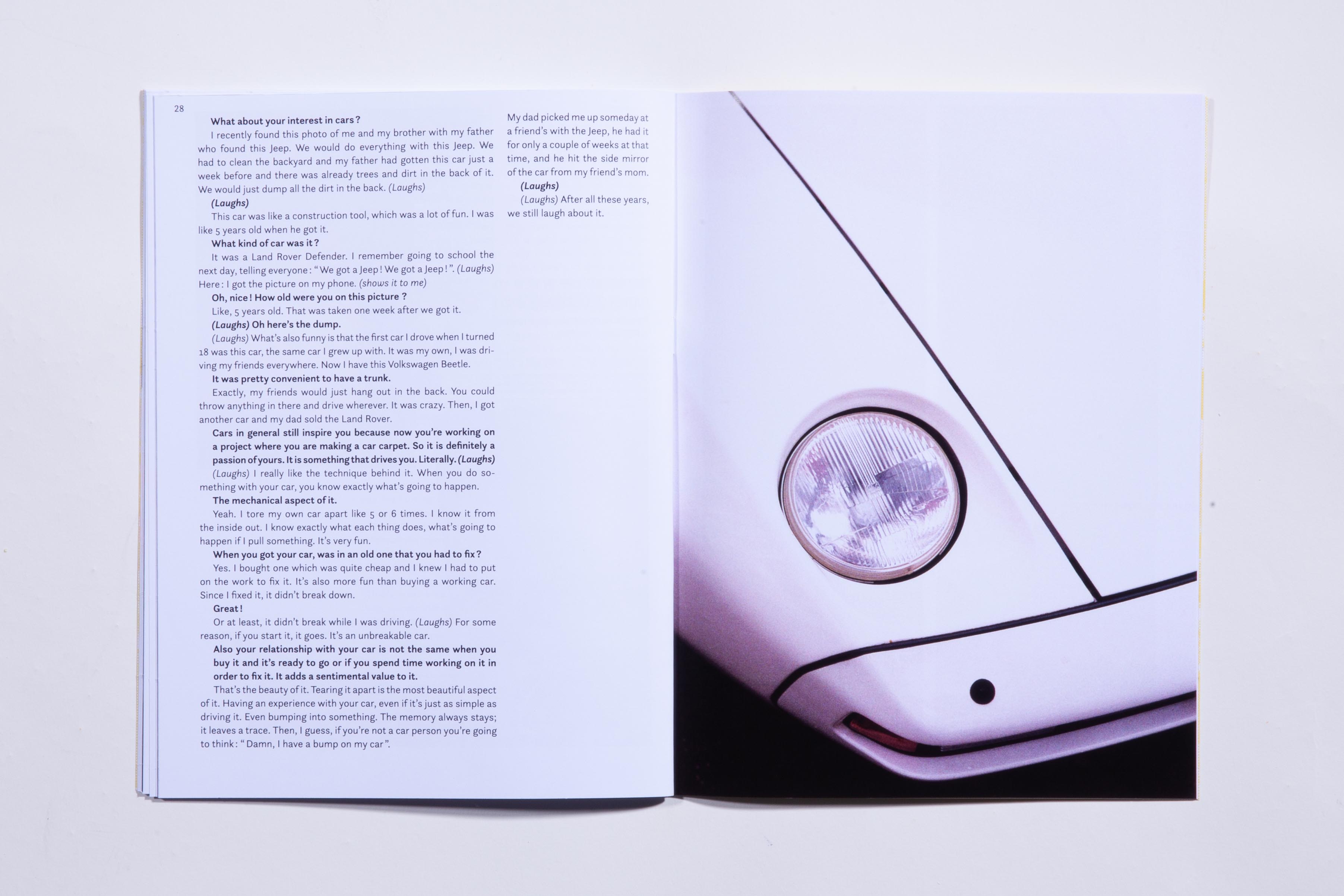
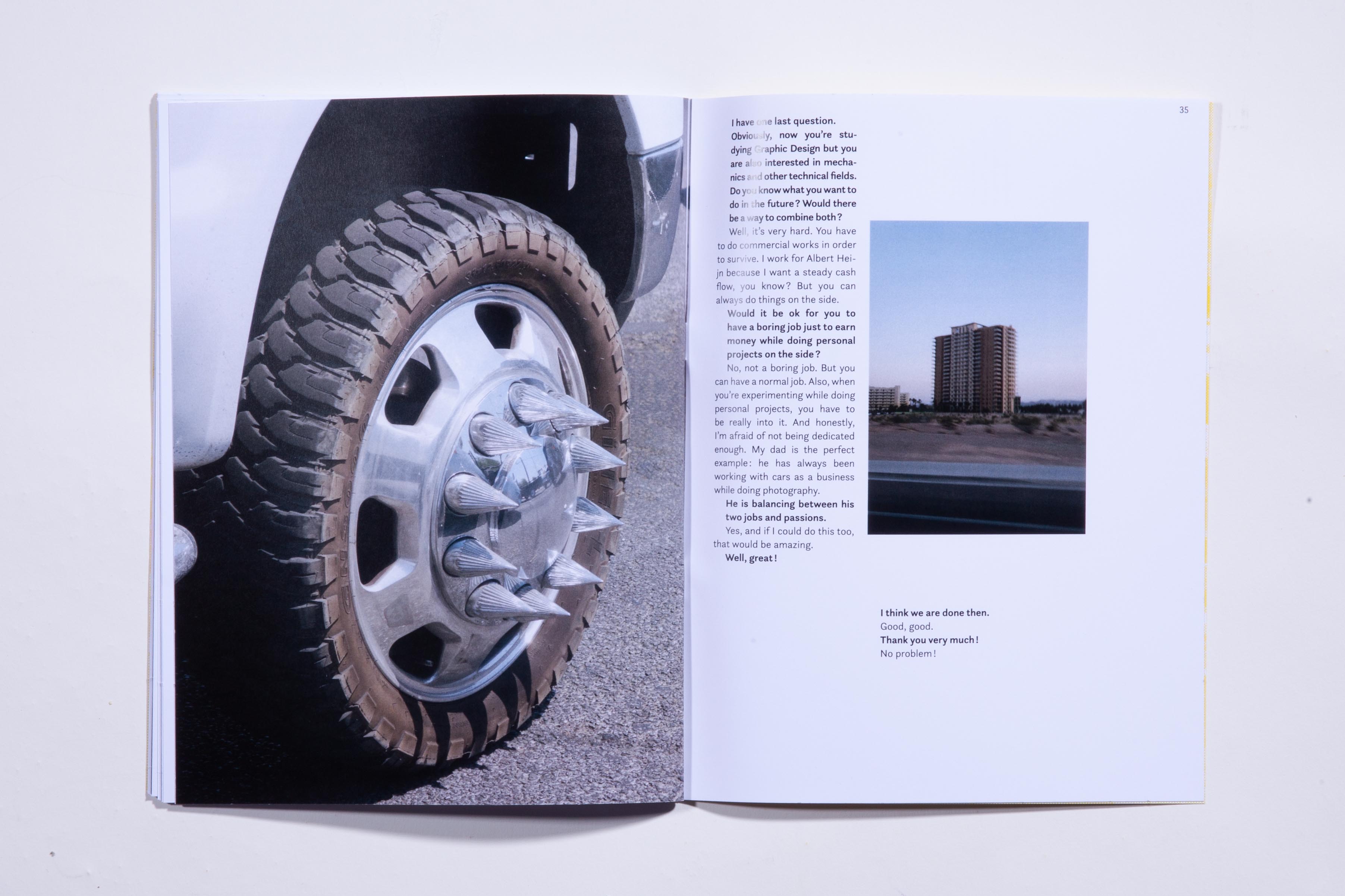
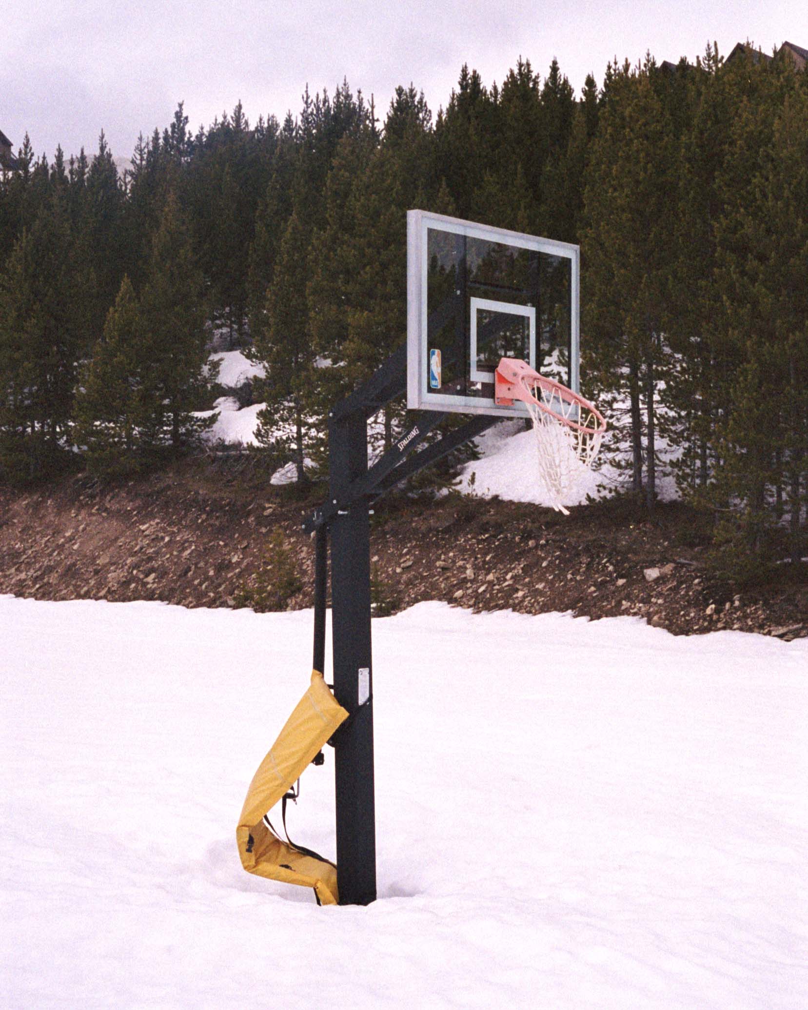
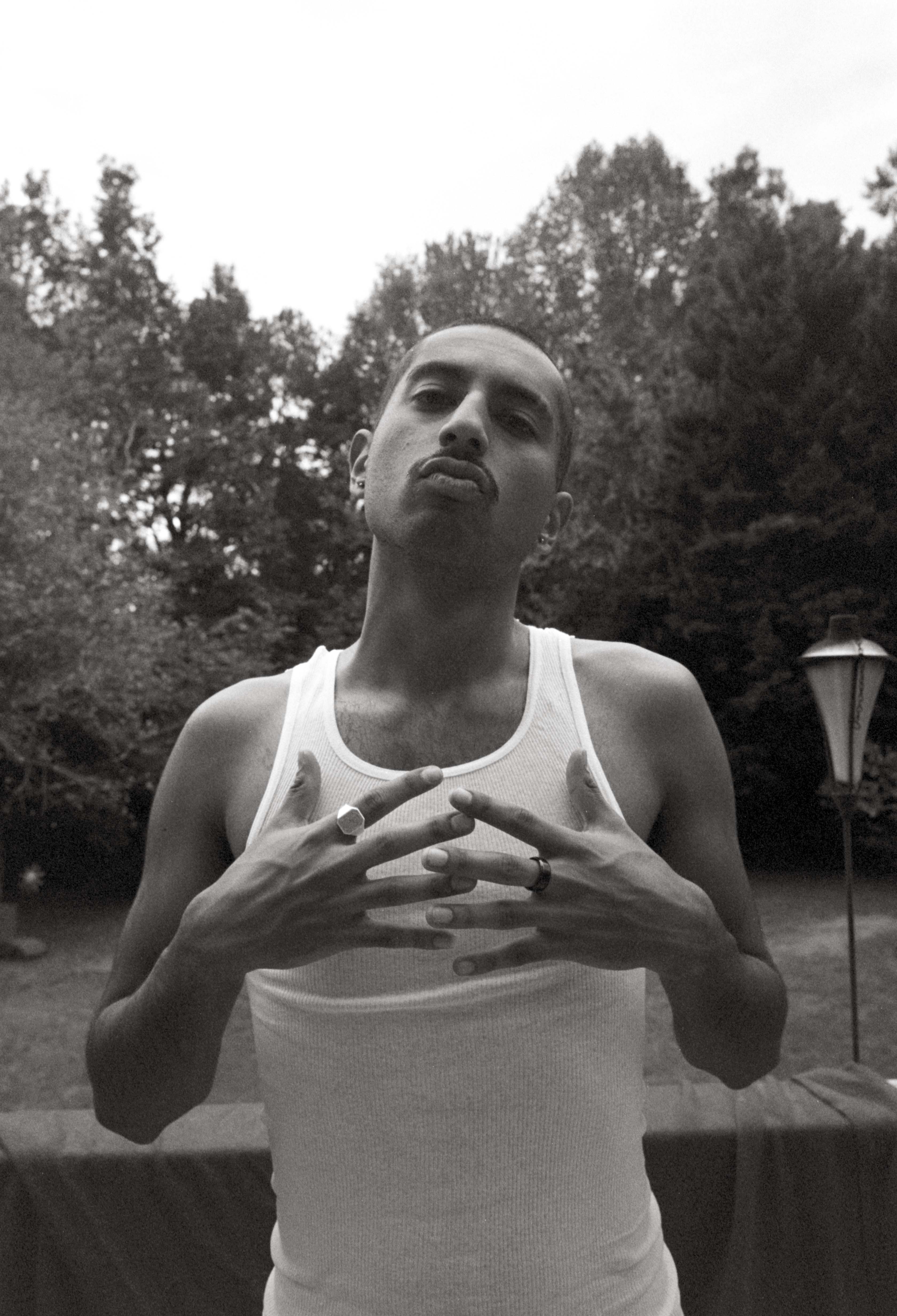
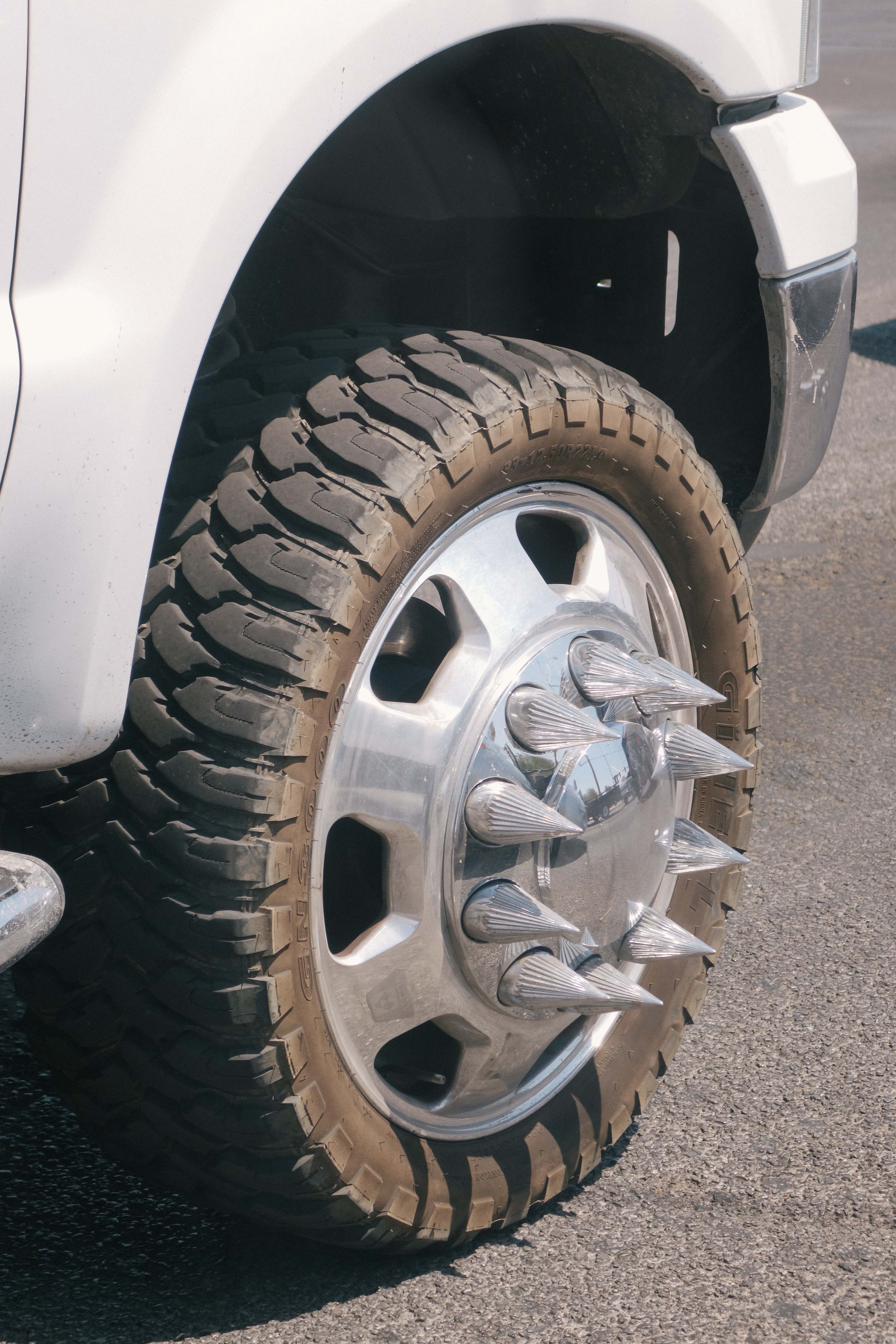
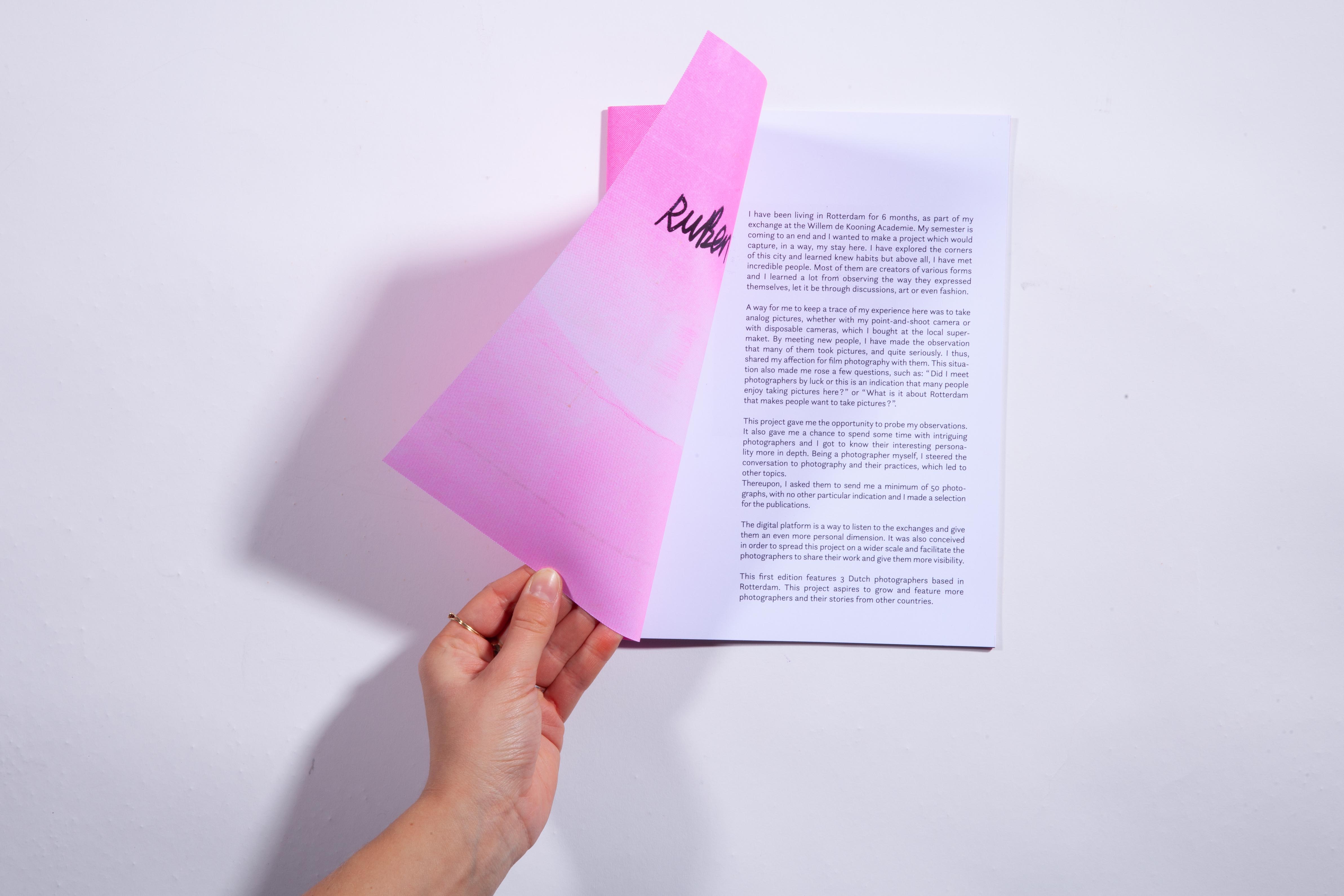
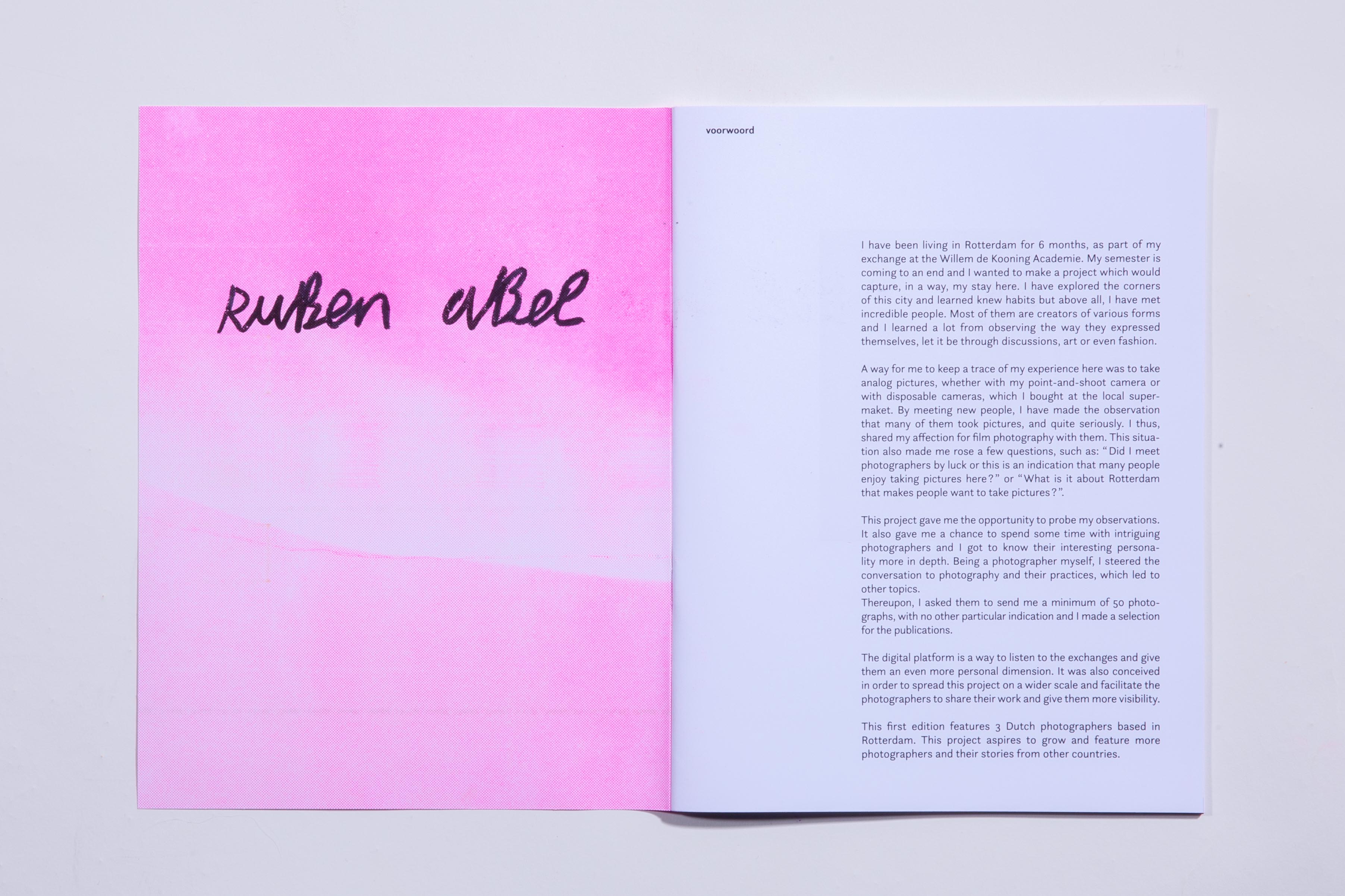
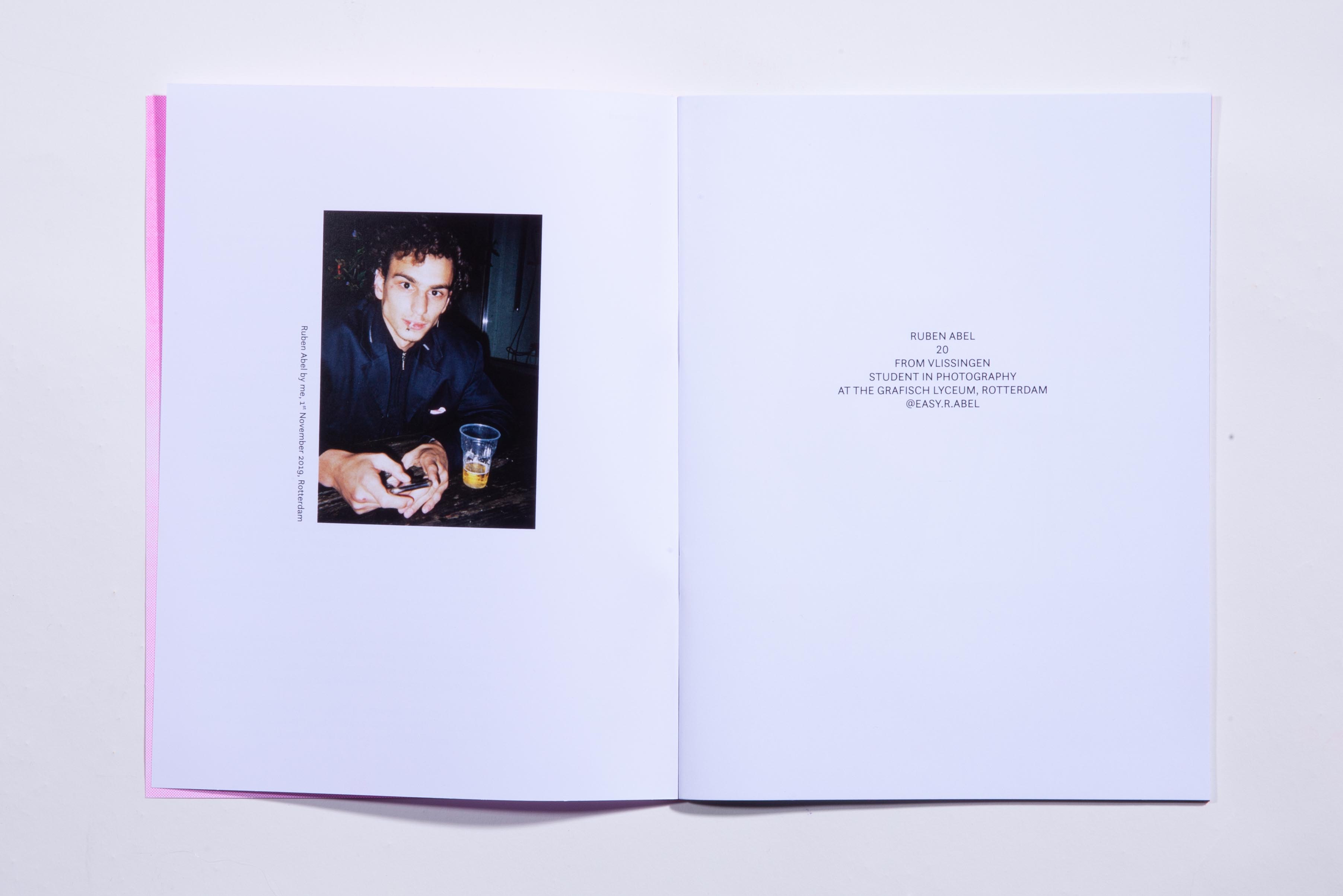
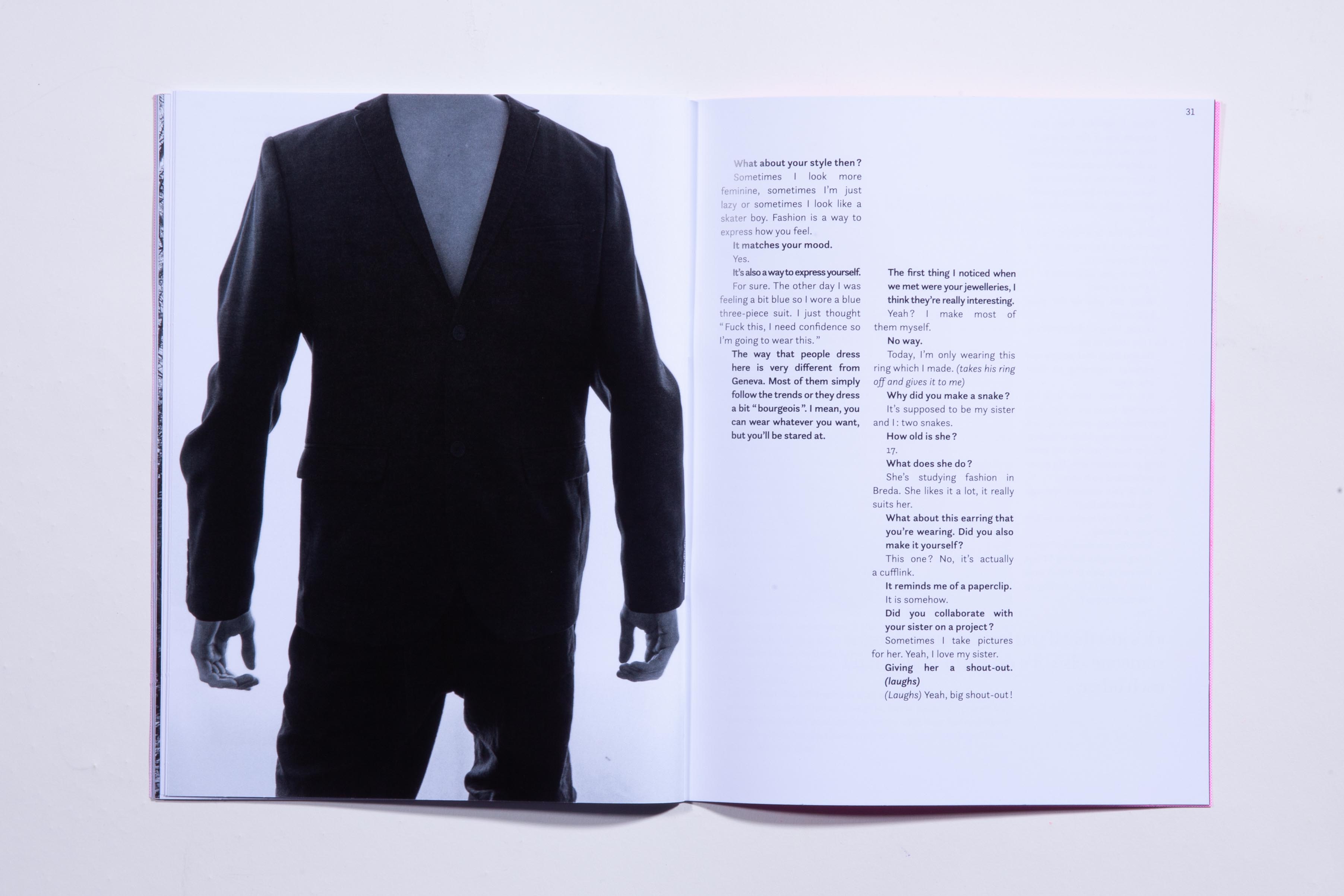
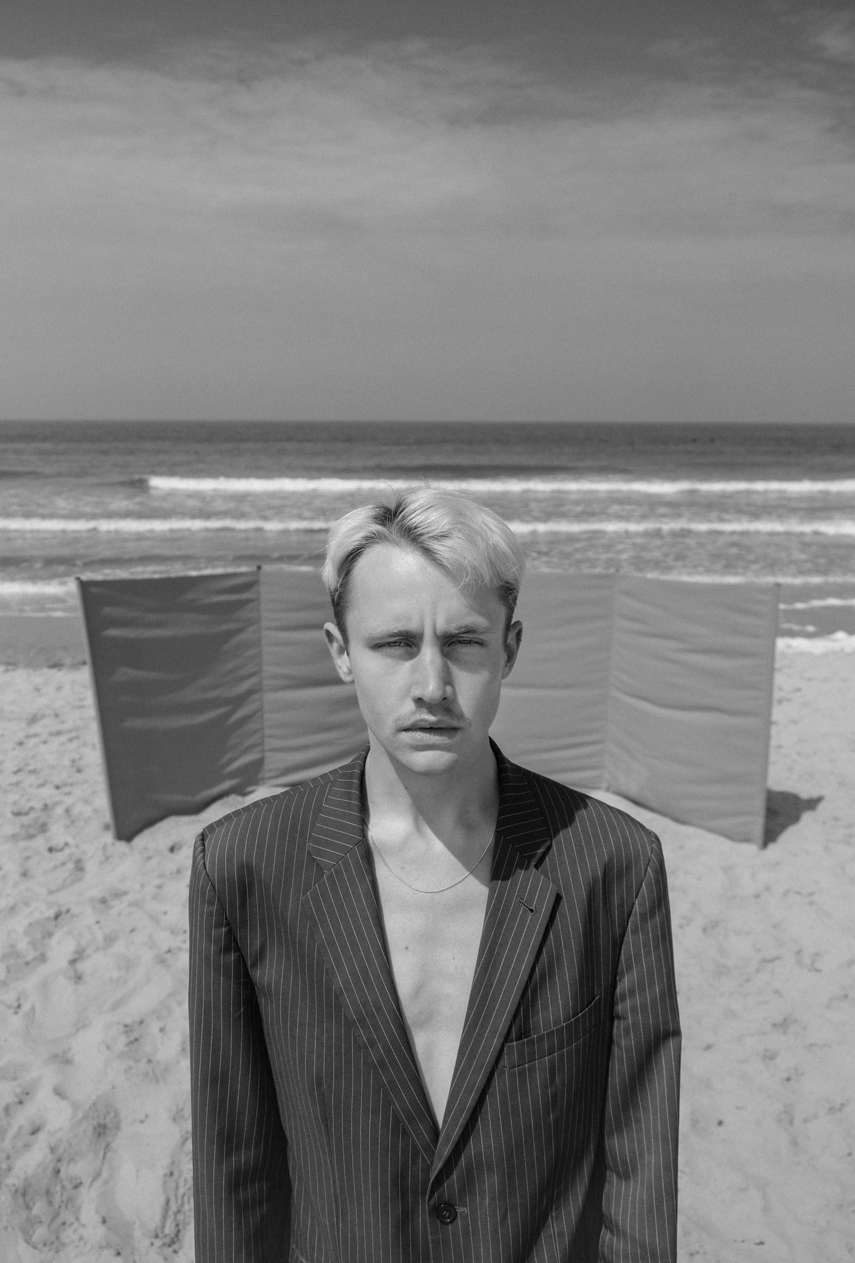
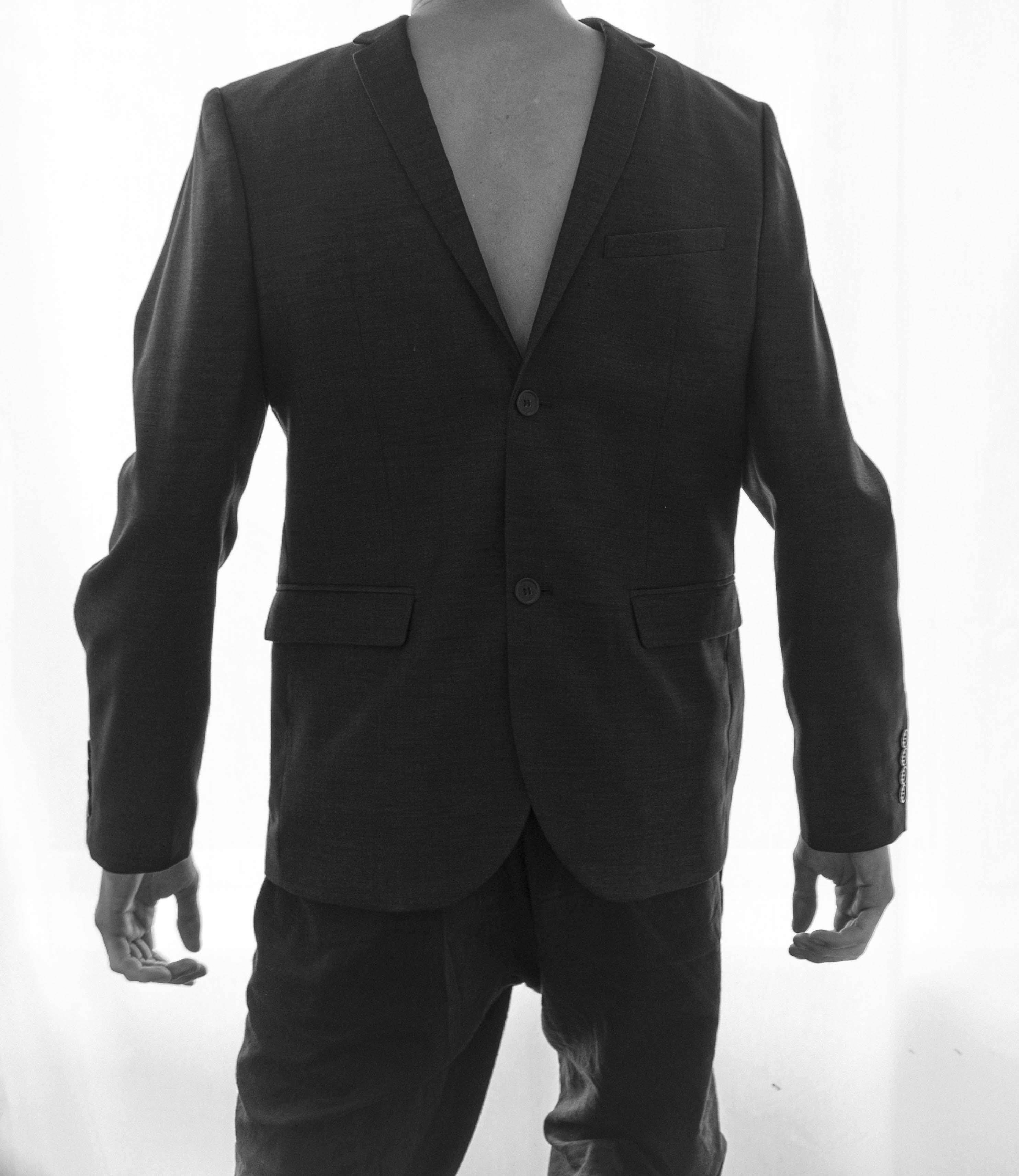
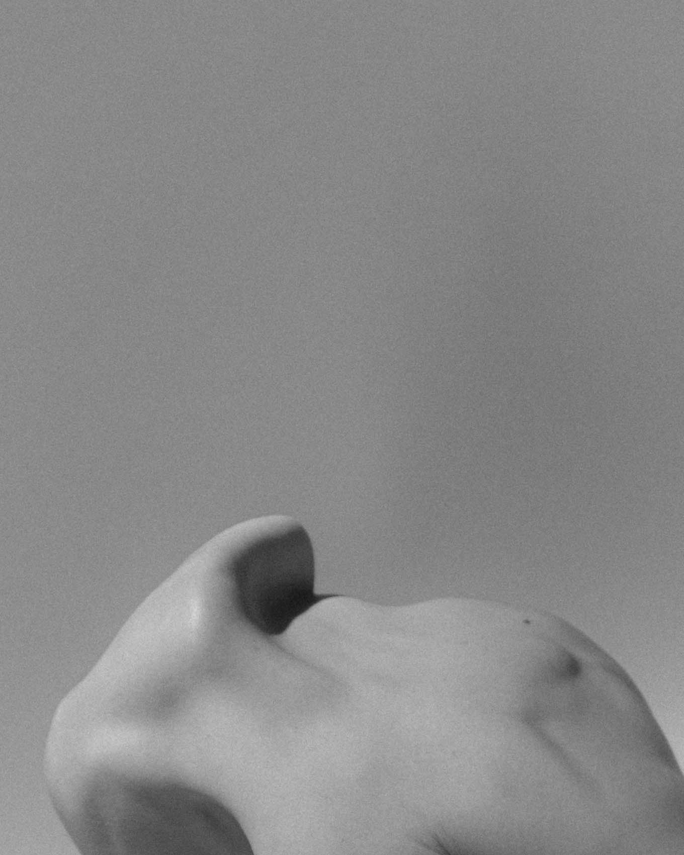
I made three books for each photographer. I asked them to send me around a hundred pictures each and I did a work of curating, choosing which ones would be illustrating the writtend interviews. The covers are risograph printed and it was the first time I experimented with this printing technique. Each photographer is associated with one colour.
Editions
Interviews, photography, recordings, curating and layout
Cover printed with a Risograph printer on 200 g/m2 Wit Paper
Inside printed on Top Color Zero 160 g/m2
In Questa Sans and Questa Grande
Format 180x240mm
Number of copies: 2 of each (one for the photographer as a souvenir and one for
myself)
Website
Coding, recordings, photography and curating
January 2020
I also coded a website in which you can order the books and listen to the interviews like podcasts. On the website, you can only see one picture per photographer and it changes every week. So if you want to discover more photographs, you have to check out the printed editions.
The printed editions and the website are complementary.
This project was conceived as an evolutive plateform, featuring more stories and photographers.
Donkere kamer means darkroom since we all share the interest in film photography.
I chose the font Questa, a typeface designed by Dutch designer Martin Majoor.


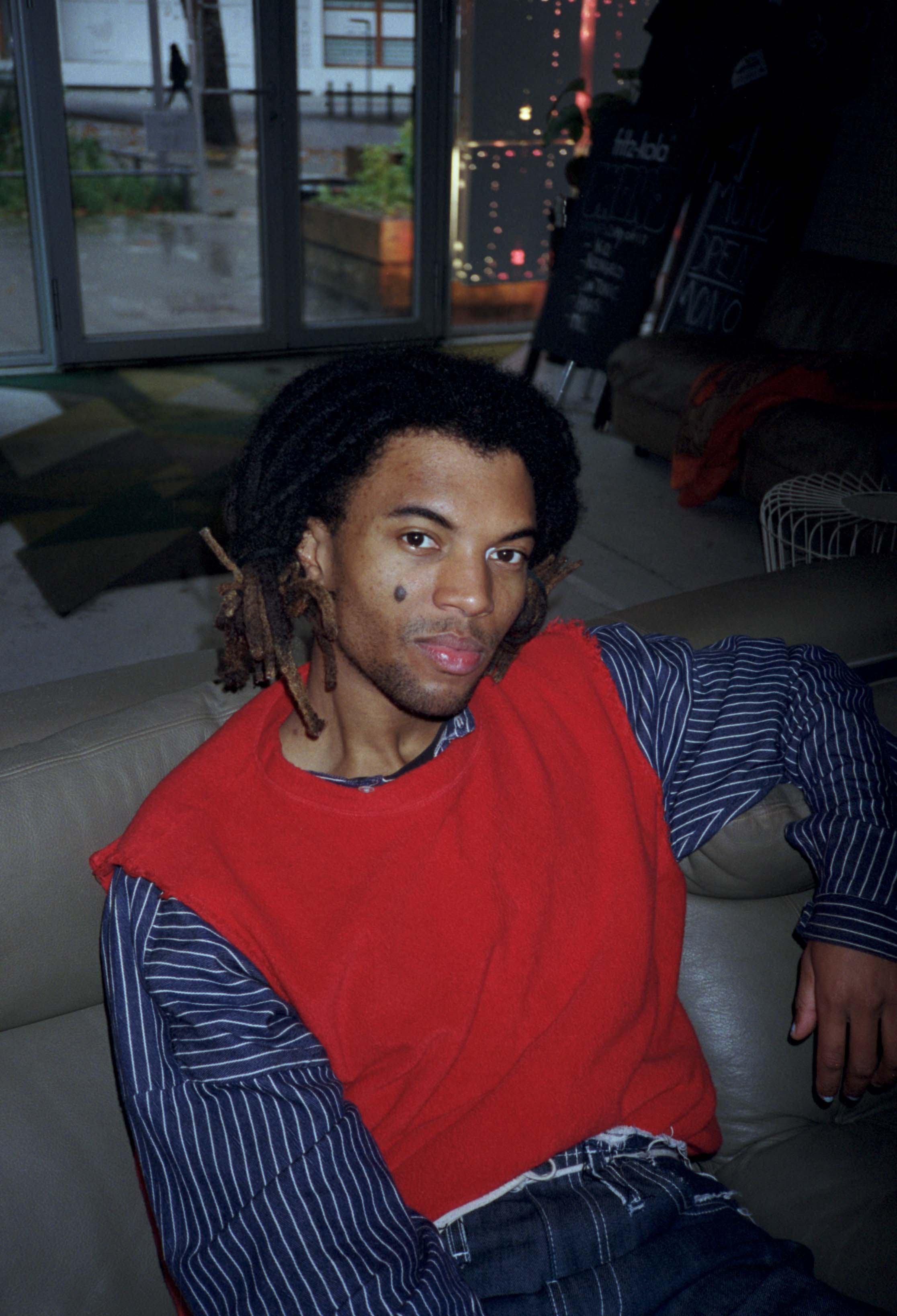
Max Morel
![]()




Ruben Abel


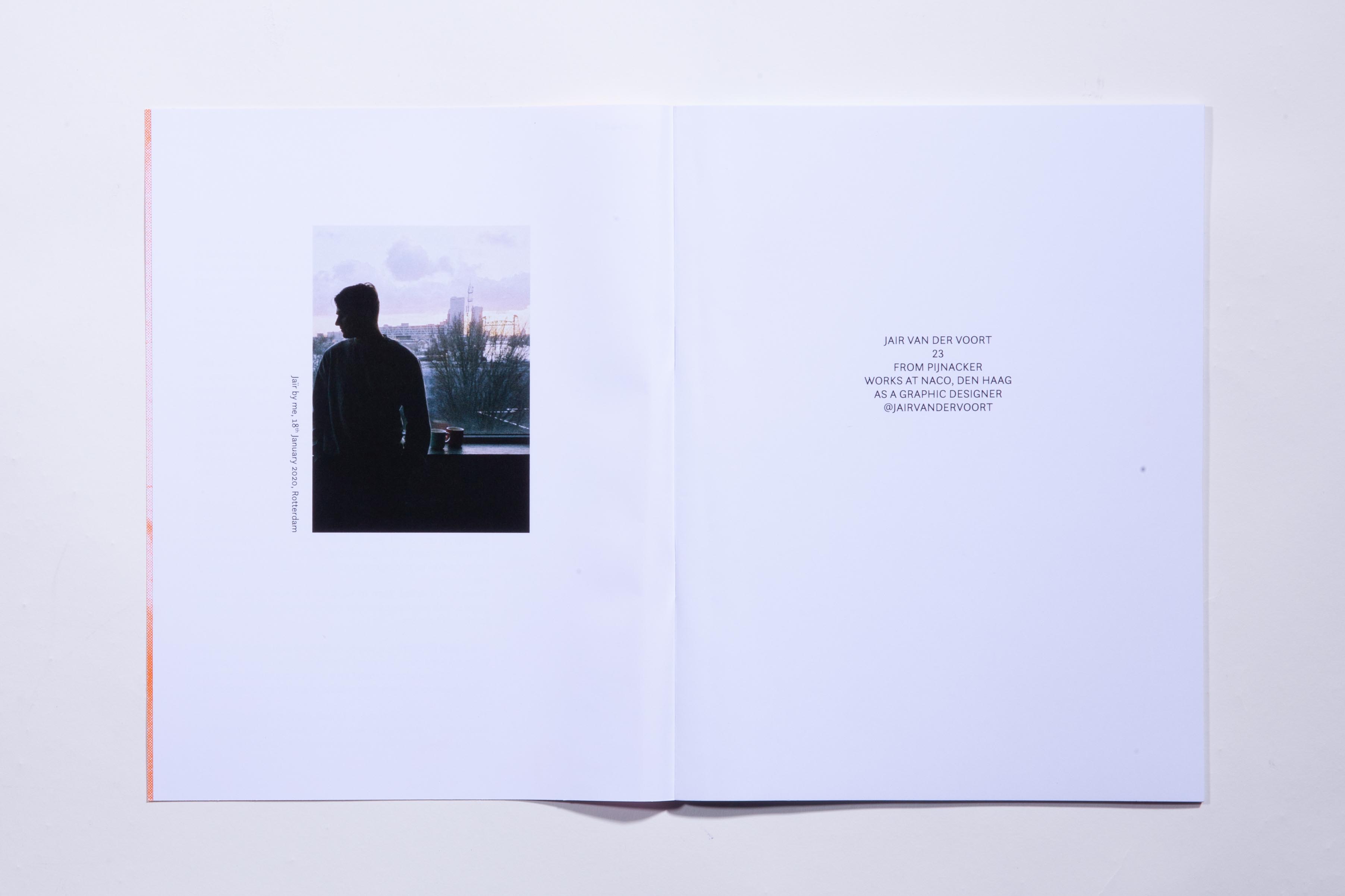
Jaïr Van Der Voort
![]()
